Fade To Black – Responsive CSS Gradients
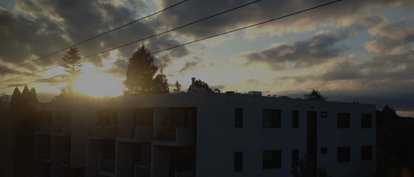
 Responsive design brings a fascinating array of challenges to both designers and developers. Using background images in a call to action or blockquote element is a great way to add visual appeal to a design, as you can see in the image to the left.
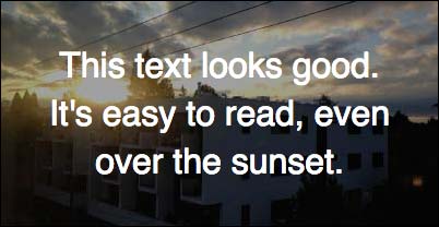
 However, at mobile sizes, you’re faced with some tough decisions. Do you try and stretch the image to fit the height of the container? If so, at very tall/narrow widths, you’re forced to load a giant image, and it likely won’t be recognizable.
In addition, forcing mobile users to load a large image is bad for performance. Creating custom responsive image sets would work, but that sets up a maintenance problem, something most clients will not appreciate.
Luckily, there’s a solution that allows us to keep the image aspect ratio, set up standard responsive images, and it looks great on mobile as well. The fade-out!
I’ll be using screenshots and code here, but I’ve also made all 6 steps available on CodePen if you want to play with the code and try out different colors, images, etc…
Let’s start with that first blockquote:
(pen) This is set up for desktop – the image aspect ratio is determining the height of the container using the padding ratio trick. Everything in the container is using absolute positioning and flexbox for centering. We have a simple rgba() background set using the :before pseudo-property in the .parent-container:
  :before {
    content: "";
    display: block;
    position: absolute;
    width: 100%;
    height: 100%;
    background-color: rgba(0,0,0,0.4);
    z-index: 10;
    top: 0;
  }
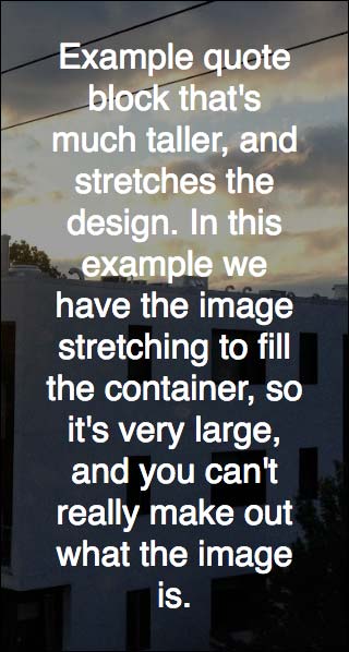
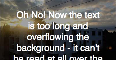 (pen) The issues arise once we get a quote of reasonable length, and/or the page width gets too small. As you can see, it overflows and breaks quite badly.
 (pen) We can fix this by setting some changes to take place at a certain breakpoint, depending on the max length of the field and the size of the image used.
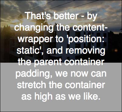
Specifically, we remove the padding from the parent element, and make the .content-wrapper position: static. (I like to set a min-height as well just in case the content is very small)
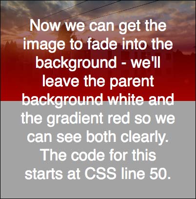 (pen) Now we can add the fader code –
 background-image: linear-gradient, which can be used unprefixed. This is inserted into the .image-wrapper using another :before pseudo-element:
  :before {
    content: "";
    display: inline-block;
    position: absolute;
    width: 100%;
    height: 100%;
    background-image: linear-gradient(
      // Fade over the entire image - not great.
      rgba(0, 0, 0, 0.0) 0%,
      rgba(255, 0, 0, 1.0) 100%
    );
  };
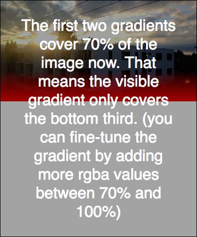 (pen) The issue now is that the gradient covers the entire image, but we can fix that easily by adding additional
 rgba() values, in effect ‘stretching’ the part of the gradient that’s transparent:
  :before {
    background-image: linear-gradient(
      // Transparent at the top.
      rgba(0, 0, 0, 0.0) 0%,
      // Still transparent through 70% of the image.
      rgba(0, 0, 0, 0.0) 70%,
      // Now fade to solid to match the background.
      rgba(255, 0, 0, 1.0) 100%
    );
  }
 (pen) Finally, we can fine-tune the gradient by adding even more
 rgba() values and setting the percentages and opacity as appropriate.
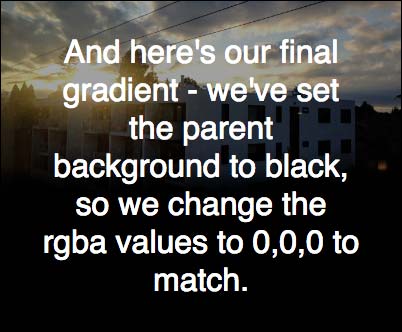
Once we’re satisfied that the gradient matches the design, all that’s left is to make the gradient RGBA match the .parent-container background color (not the overlay – this tripped me up for a while!), which in our case is supposed to be #000:
  :before {
    background-image: linear-gradient(
      rgba(0, 0, 0, 0.0) 0%,
      rgba(0, 0, 0, 0.0) 70%,
      // These three 'smooth' out the fade.
      rgba(0, 0, 0, 0.2) 80%,
      rgba(0, 0, 0, 0.7) 90%,
      rgba(0, 0, 0, 0.9) 95%,
      // Solid to match the background.
      rgba(0, 0, 0, 1.0) 100%
    );
  }
We’ll be rolling out sites in a few weeks with these techniques in live code, and with several slight variations to the implementation (mostly adding responsive images and making allowances for Drupal’s markup), but this is the core idea used.
Feel free to play with the code yourself, and change the rgba() values so that you can see what each is doing.