Fast, Relevant, and Easy to Read

First, a little history.
Once upon a time, front-end development was fairly simple – you wrote HTML and CSS, tried to use as few images as possible, and your only goal was to try and get the site to look as much like the design as possible – browsers and technology permitting.
As the web grew and sprawled, search engines came onto the scene to help people find sites. They were roughly divided into two types: curated catalog sites (Yahoo! being the biggest and most important of these) and search engine sites, which tried to crawl the entire web and used algorithms to show you the most relevant results (There were a lot of these, most using one or two engines – Lycos, AltaVista, Ask Jeeves, being just a few examples. In my opinion, they were pretty meh.)
Then, along came Google. It was far more useful because it prioritized relevance, both in the content searched and in the value of the links to your site. Also, the way Google first displayed ads was so minimal, the ads were actually useful. But that was over 20 years ago – almost everything about Google has changed since then. Now, the massive corporation is so dominant that it’s become verbed, and it’s facing an antitrust lawsuit from the US Justice Dept.
Back in those early days, you could ‘game’ the search engines in a variety of ways, some fairly benign (using a particular phrase a lot, the right domain name, etc.), and some very nefarious (link farms, invisible text, etc.). But for the last few years, the only way to consistently get good results has been to do what Google tells you to do.
The Three Pillars of Page Rank
Google’s goal is to make pages as fast, well-structured, and as easy to read as possible. Why? So they can serve more ads! Here’s the breakdown: if you look at 60 pages an hour vs 50 pages, Google serves more ads, and thus, makes more money. It just so happens that what Google wants and what’s good for the people using your website are complementary. For example, when you have a fast donation page, you get more donations.
When Google can understand what’s on your page, someone searching for that content can find it more easily. And when you prioritize making it easy for a web crawler like Googlebot to understand everything on your site, people who use assistive technologies (such as braille or screen readers) won’t have to go through the trouble of taking you to court just to order a pizza.
So how do we prioritize this ease of navigation? We’ll break it down into three distinct goals: Performance, SEO, and Accessibility.
Performance: mobile-first, mobile fast.
As sites have become more complex over the years, so too has the size of the average page. This is annoying enough when you’re using a desktop computer, but when you’re on a slow data network and loading it on a phone it’s unbearable. Google’s research indicates that more than half of site visits are abandoned if a mobile site takes more than three seconds to load.
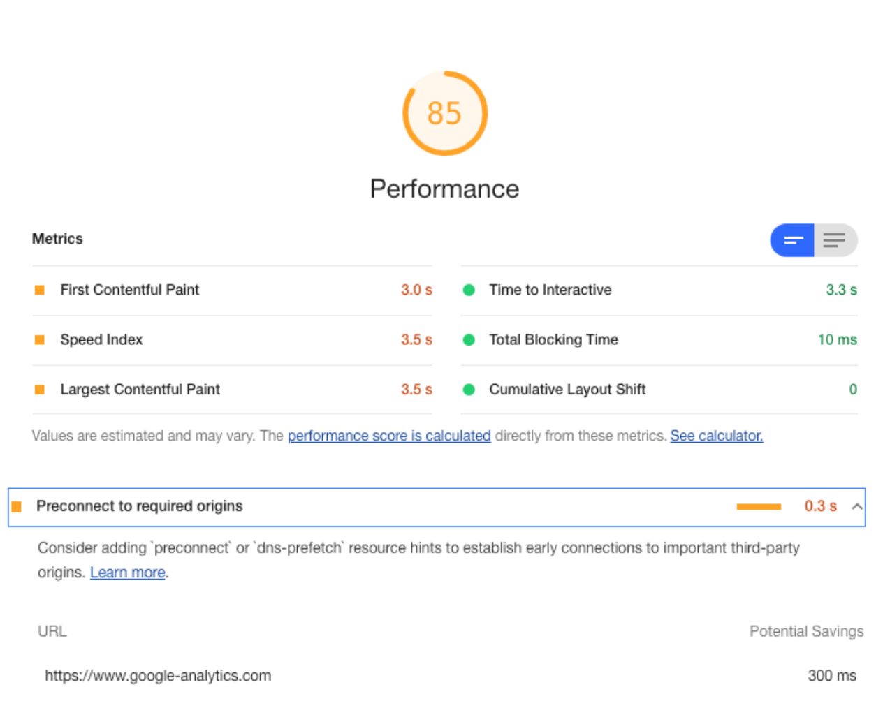
The good news is that there are a ton of great resources available to help performance-tune your website, with Google’s Lighthouse being the easiest tool you can use to get started. It does a great job of showing you site metrics (that is, how they score your site), as well as opportunities to improve performance:

Site name withheld to protect the potentially embarrassed.
SEO, or, would you buy a used car from this consultant?
Search Engine Optimization has built somewhat of a bad reputation over the years; a little deserved, a little not. At its heart, SEO as a practice seemed to turn sour if taken too far. And if you hired a consultant to improve your site, they probably took it too far. Having an incentive to make big changes with noticeable improvement as quickly as possible would often result in consultants resorting to trickery– giving your site a quick boost in the short-term, even if it made your site less likely to get good results in the long-term. And in reality, a long-term investment in content strategy, applicability, best practices, and regular content updates takes time to develop.
Lucky for us, Google’s done a good job in being clear about what helps improve the Page Rank score for sites and what hurts it, which has done a lot to level the playing field for SEO. You can even find great articles about SEO that aren’t a direct pitch to hire a consultant!
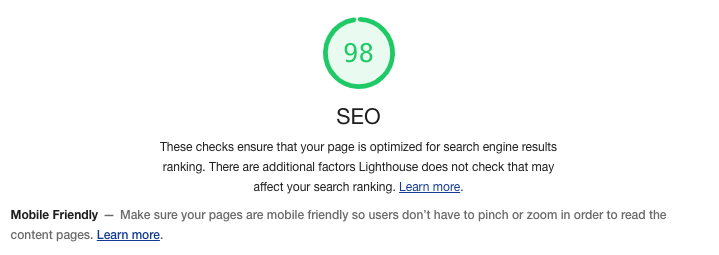
Google’s Lighthouse displays SEO in the same standard format as the other sections: the automated tests that indicate technical issues that directly impact page rank, and a link to the Google documentation regarding best practices:

This is one of the few parts of site development where you need to make sure the content strategy team, marketing, and/or sales (whoever is in charge of the site copy) is on the same page as the development team. Educating the people who develop and maintain site content at the beginning of a project will make your life easier as a developer, because the content almost always gets added to a site after it’s built. Having all players understand the goals and structure of content best practices will make implementation much smoother.
Accessibility: making the web useful for everyone.
An area of site development that has been severely overlooked in the evolving complexity of the web has been accessibility. When sites were mostly text with a few images, assistive technology generally worked well because it just needed to read the page. So as long as you used good alt text in your images, a page could be parsed by a braille reader or a text-to-speech device. (One of the ways to check this was by using a text-based browser such as Lynx. If you could read it in Lynx, you were probably fine.)
But today’s web sites have become much more complex, and this has meant that developers need to take extra steps to ensure that they are machine readable. To do this, developers need to stay savvy and use best practices – such as semantic markup, metatags, ARIA labels, and regular audits of your work using tools like WAVE, native screen readers, and of course, Lighthouse:

A good start.
As mentioned in the Lighthouse result, only some of the potential issues with accessibility can be automatically detected, so understanding the concepts that make a page accessible and regularly auditing your work as you build a site is the best approach. Discovering that you need to restructure your HTML at the end of a project when you’re out of budget will make everyone sad. And it will expose your client to liability, which is extra-sad. More importantly, the web needs to be useful for everyone, so making accessibility part of your normal workflow shouldn’t be optional or viewed as an extra step. It should be integrated into your workflow as a mandatory practice – just like any other part of the web design process.
Putting it all together: Fast, Relevant, and Easy to Read.
Building a site today is more complex than ever. Front-end developers need to balance the requirements of a design, the tools best suited for implementation, the long-term maintainability of the site by non-developers, and the ever-growing legal risks that can be part of a high-profile client site.
Google Lighthouse provides a set of tools to help you ensure you’re on the right track, and by thinking of these disparate requirements in terms of speed,
relevance, and readability, you can have a clear frame of reference for your work to guide you through a project.