Accessibility for Teams in a Hurry: Links & Buttons

Links and buttons can cause all kinds of accessibility bugs. Everyone that uses a website engages with links and buttons countless times without even thinking even about it. When you do have to stop and think about what a button does, or where it goes or why it’s not working, it’s frustrating.
This topic is especially important because links and buttons are how we actually do anything online. Without access to the links and buttons on a site, people are excluded from information and experiences. At ThinkShout, our process for creating accessible links and buttons is highly collaborative and as what we build becomes more complex, responsibilities are shared more and more.
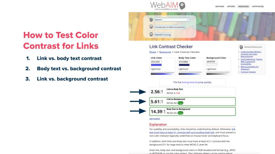
Test Color Contrast for Links

Testing color contrast for links and buttons has an additional guideline to consider:contrast when a link is in body text. If a body copy link doesn’t have underlines, it needs to have a 3:1 contrast ratio between itself and surrounding text in addition to the foreground vs. background ratio of 4.5:1. The WebAIM color contrast checker can specifically test link color contrast within body copy. The goal here is for your site visitors to know when something in body copy is a link.
Define Action States for Buttons
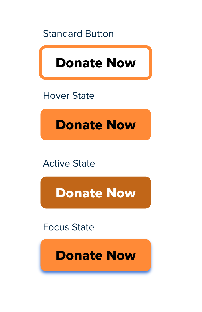
 When designing a button, four action states that need to be considered:
- Standard: how it looks by default.
- Hover: How it looks when a user has hovered, but not yet selected
- Active: how it looks when it has been selected
- Focus: how it looks when you navigate to it with a keyboard.
Action states give a visual queue to users that they are engaging with a button. Most teams know to create a hover state, but defining a focus state will make navigating a page with a keyboard much clearer and easier.
This is an area where collaboration between design and development is key in the handoff and during implementation. If action states are missing, our developers ask the designer what they should be. If the designer finds one is missing during QA, they let the developer know.
Give Buttons and Actions Clear Labels
Accessible labels can happen during content creation AND in the code.
Loop in Content Creators
Labeling buttons and links is another area that requires a full team effort and often involves multiple stakeholders to align on language. Clearly Labeling an action is just as important as having a headline that makes sense. While many of these interactions feel minor while designing a system, they are meaningful and should be carefully considered. Designers should collaborate with stakeholders to make accessible language recommendations.
Icon Buttons Need Labels Too
When coding a site, a common bug is on icon buttons that do not include labels. Search, hamburger and social media buttons are notorious for developers forgetting to put a label on them which means you only know what they do if you can see the visual icon. You can use a property called an aria-label to add a label that’s available to assistive technology like screen readers.
Links Should Make Sense Out of Context
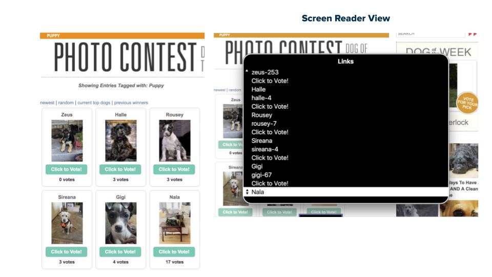
Labels need to make sense out of context because some users are navigating a site with their voice using tools like Dragon. If the text in each button is the same, folks can’t just say the name of the button without performing a workaround to access the button they want to click. When people get to a site they don’t read every word they scan the page. Instead of doing that visually, using a screen reader you can pull up a list of Headings or Links and browse that list to find what you’re looking for.

A puppy website with several “Click to Vote” buttons. More specific text in buttons helps users know what they do when visual context isn’t available.
In this example, the Click to Vote! buttons are confusing because a user wouldn’t know if they’re voting for the dog above or below the button. A simple fix here would be to change the button text to be clear, like “Vote for Zeus”.
Target Size of a Button Should be at Least 44 x 44px
In WCAG 2.1, the minimum target size for compliance is 44px by 44 px. This also matches Apple’s recommendation in their Human Interface Guidelines.
Tiny buttons are obnoxious for anyone, and even more so if you have limited mobility, Parkinson’s or low vision. Do all of your users a favor and make sure your touch targets are large enough. That doesn’t mean your design has to get huge, You can use your code to make the link target larger without impacting design.

A button with padding creates a much larger touch target than one without padding
Write Semantic Code
A span or div pretending to be a button isn’t really a button.
-
Use semantic tags like
-
Watch out for clickable elements made with
or
When keyboard testing, if you can’t land on a link or button, it probably isn’t coded as an actual link or button. In that case, you might need to rewrite some code to make it accessible.

Caption: Corgi’s pretending to be hotdogs: cute.
Spans or divs pretending to be buttons: not cute.
Testing Buttons
- Double check work by using the WAVE tool to catch missing or suspicious labels and to ensure that links make sense outside of the visual context.
- Perform a simple keyboard test by clicking near the button or link, then using the tab key I navigate to it.
- Make sure there’s a visual focus state and it matches what has been designed.
- Make sure you can click on the link or button by using the return key.
To Summarize
- Define Action States
- Give them clear labels
- Links and buttons should make sense out of context
- Target size should be at least 44px by 44px