The International Crisis Group: eEARTH
A Drupal-based platform that combines custom APIs, interactive data visualization, and thoughtful design to make large-scale, global data accessible.
A data team with a vision.
eEARTH — an acronym for the Early Action and Risk Tracking Hub — is the brainchild of the International Crisis Group [ICG]. ICG wanted to develop a tool to function as an early warning system, combining advanced data monitoring with deep field expertise to anticipate and prevent resource-related conflict. Developed through extensive work on climate security risks in the Horn of Africa, the platform needed to provide a comprehensive, multi-layered view of how resource pressures can lead to political violence.
The technology behind the tool.
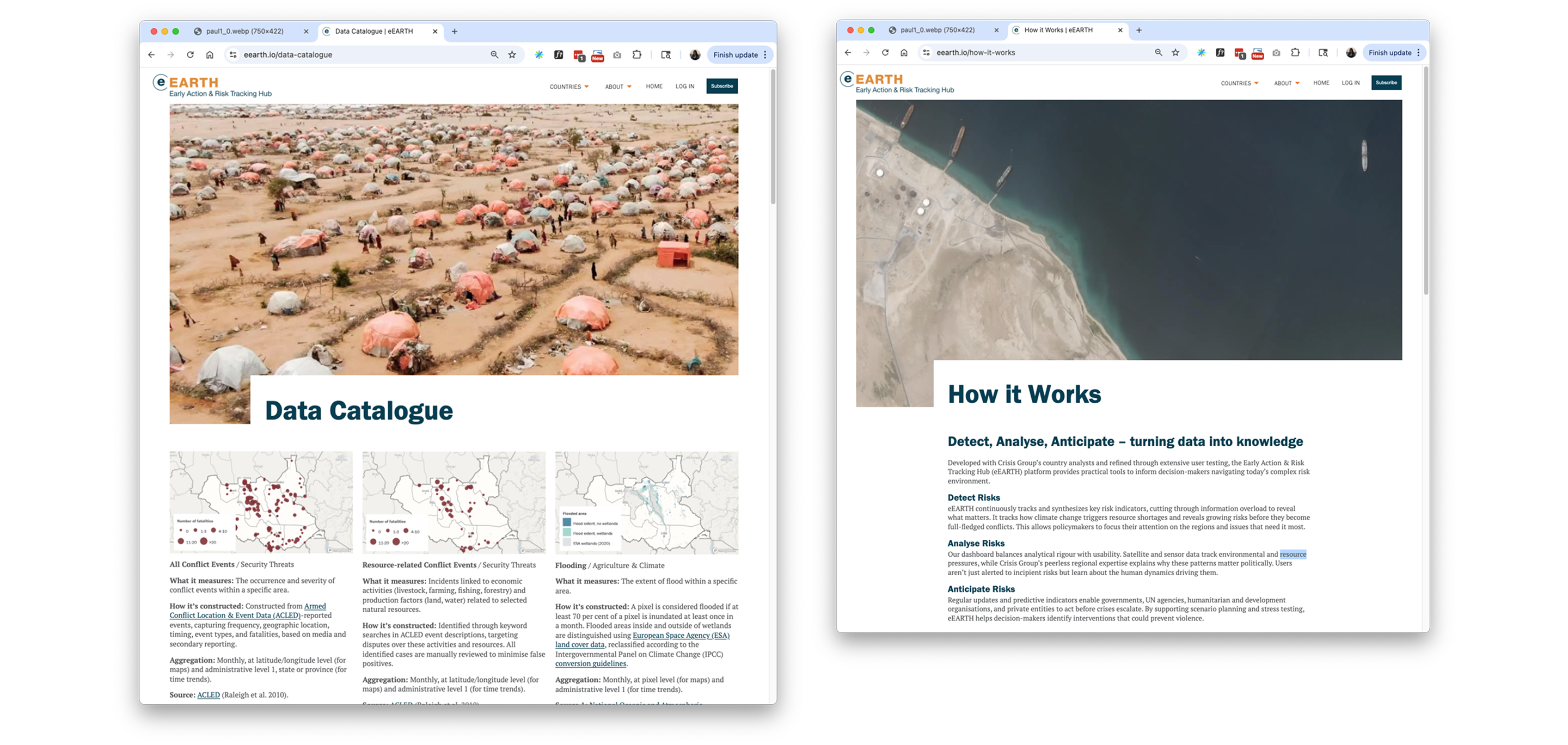
Behind the scenes, we worked closely with the client’s data science team to design and build a custom data pipeline that could support the platform’s ambitions. This included setting up a dedicated data server to download, process, and aggregate large datasets with a custom API layer to reliably deliver that data to the Drupal instance. The API is the bridge between raw data and the interactive experience — packaging complex information in a way that can be used seamlessly across maps, charts, and downloads.
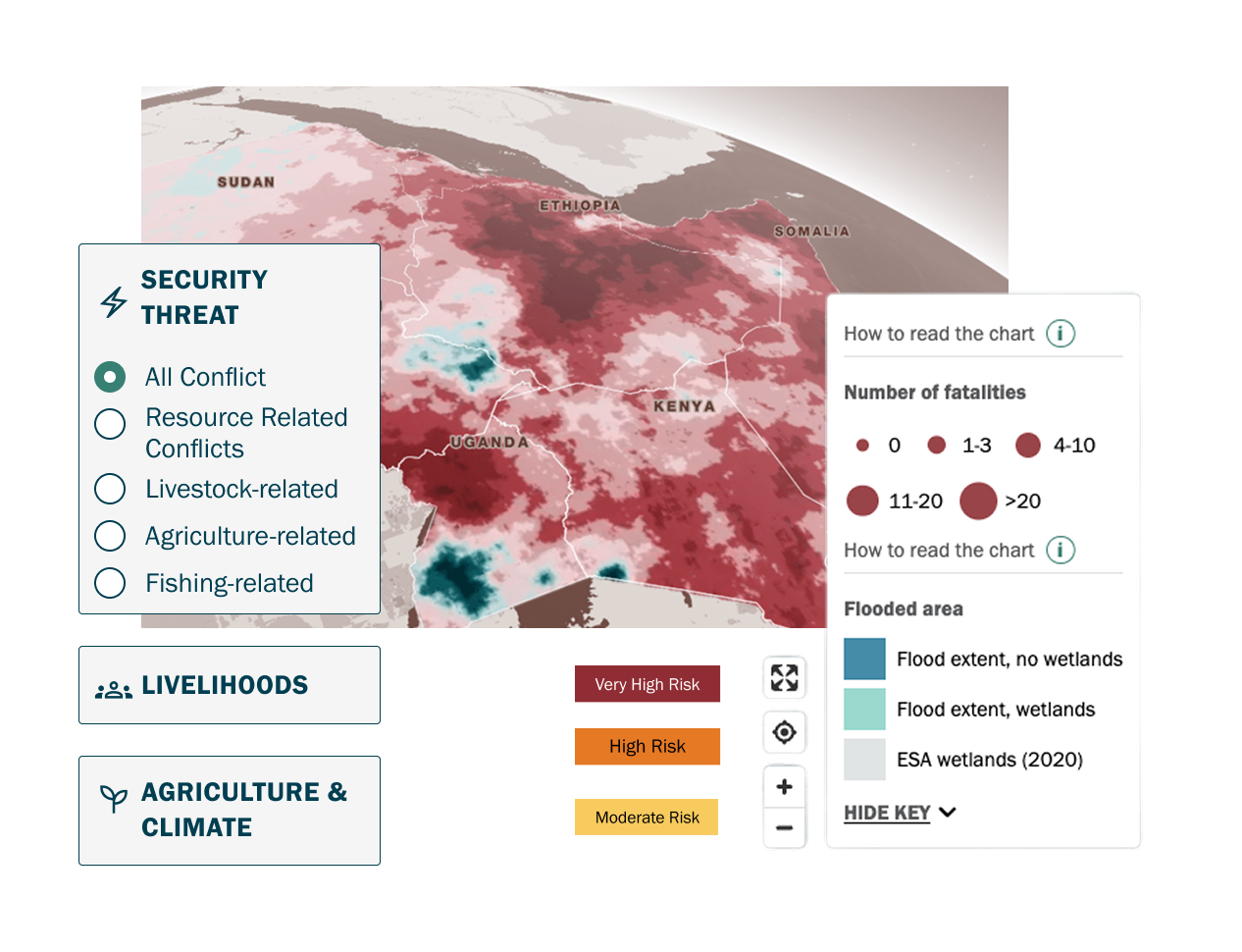
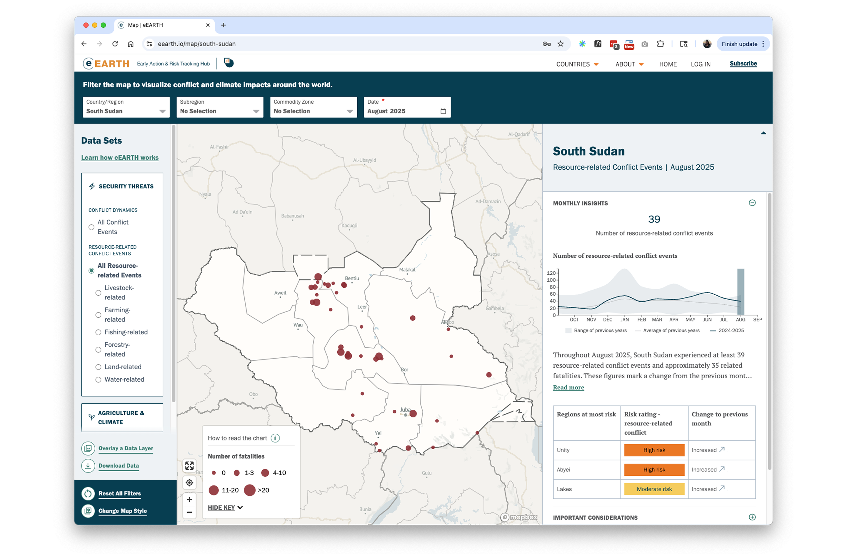
All of EEARTH’s visualizations are powered by custom JavaScript, using Mapbox for interactive mapping and D3 for charts.
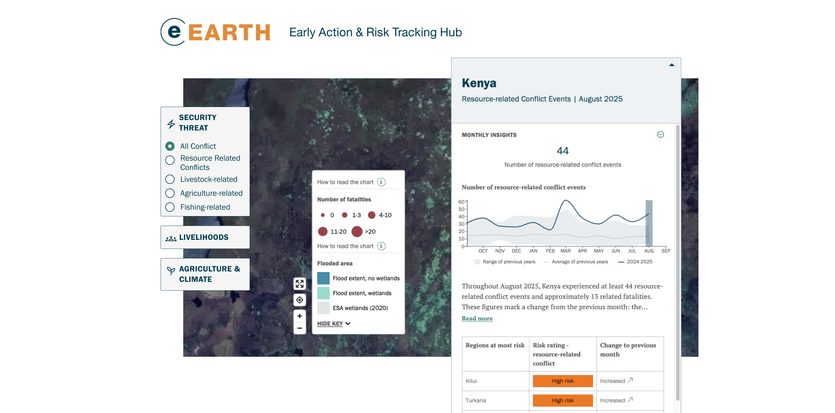
A self-paced data exploration experience.
The platform’s vision began as rough ideas and map concepts, which we refined through rapid prototyping alongside the Crisis Group team.
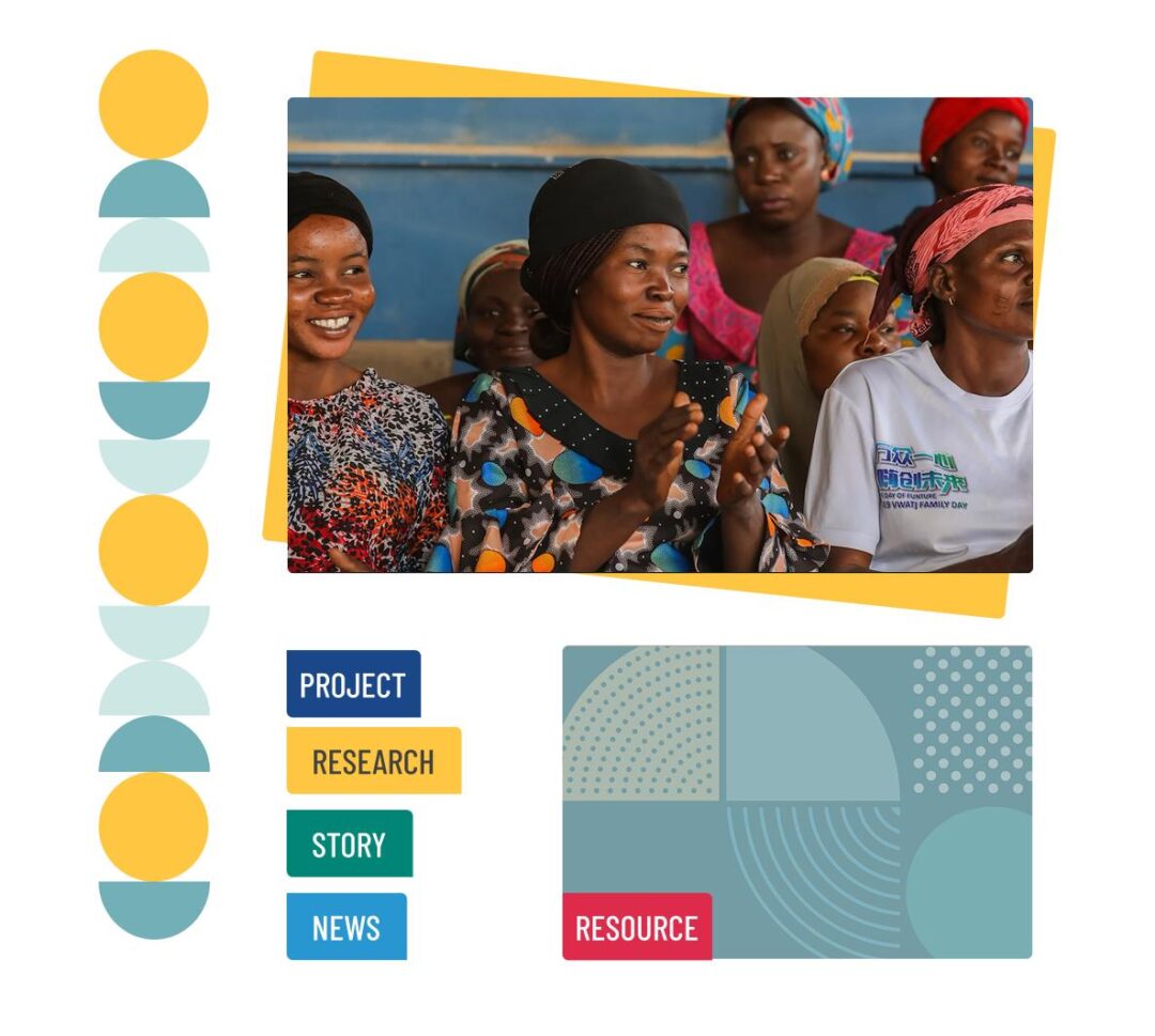
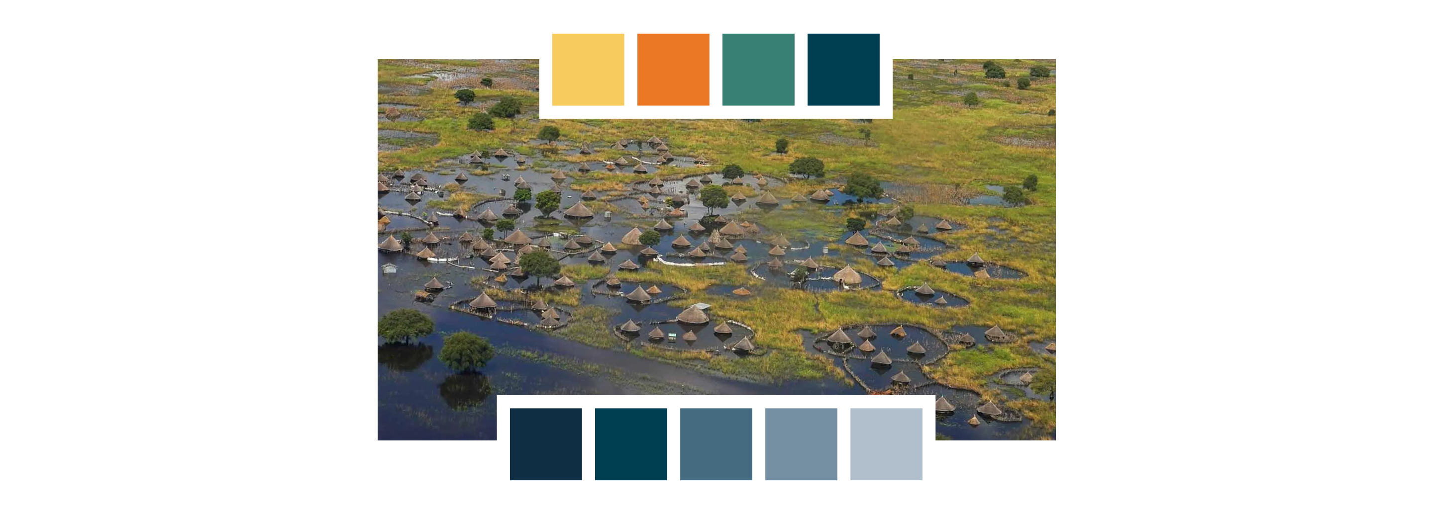
In the final product, exploration is at the forefront, with layered datasets presented in a clear, spacious layout. Crisis Group’s branding was extended into the map experience itself, styling Mapbox layers to feel cohesive with the broader design system. Thoughtful use of color hierarchy, wayfinding iconography, and contextual copy helps users navigate the platform and understand the implications of the data.
Registered account users are able to download raw datasets through the API and export images of maps and charts to create presentations and reports. This combination of visual storytelling and direct access to data makes the platform valuable to both casual users and advanced researchers.

Results
Built as a pilot with limited data and countries, the platform was intentionally designed to be capable of accommodating more datasets, geographies, and future ambitions without constraint. As of January 2026, the tool spans data coming from over 15 sources, like ACLED and NOAA, and has grown to feature 8 countries.
Explore More