Safe Horizon
A WordPress website designed and built with the people Safe Horizon serves at its heart. Prioritizing safety, clarity, and accessibility.
Building for the user.
Safe Horizon is the largest nonprofit victim services agency in the United States, offering support to survivors of violence and abuse across New York City. As an organization that serves multiple, high-stakes audiences — from people seeking immediate help to donors and policymakers — Safe Horizon needed a redesign that delivered a streamlined, trauma-informed user experience.
Modern design built for a mission-driven audience.
In this project, we collaborated with Design for Progress [DfP], a New York-based brand and design studio, who created a new brand and visual identity for Safe Horizon. We picked up where DfP left off, translating a beautiful new brand into a complete digital design system.
In the digital brand application, we focused on accessible color combinations, interactions, and typeface applications that played with scale. The end result is a grounded, contemporary look with an established visual hierarchy that makes navigation easy.
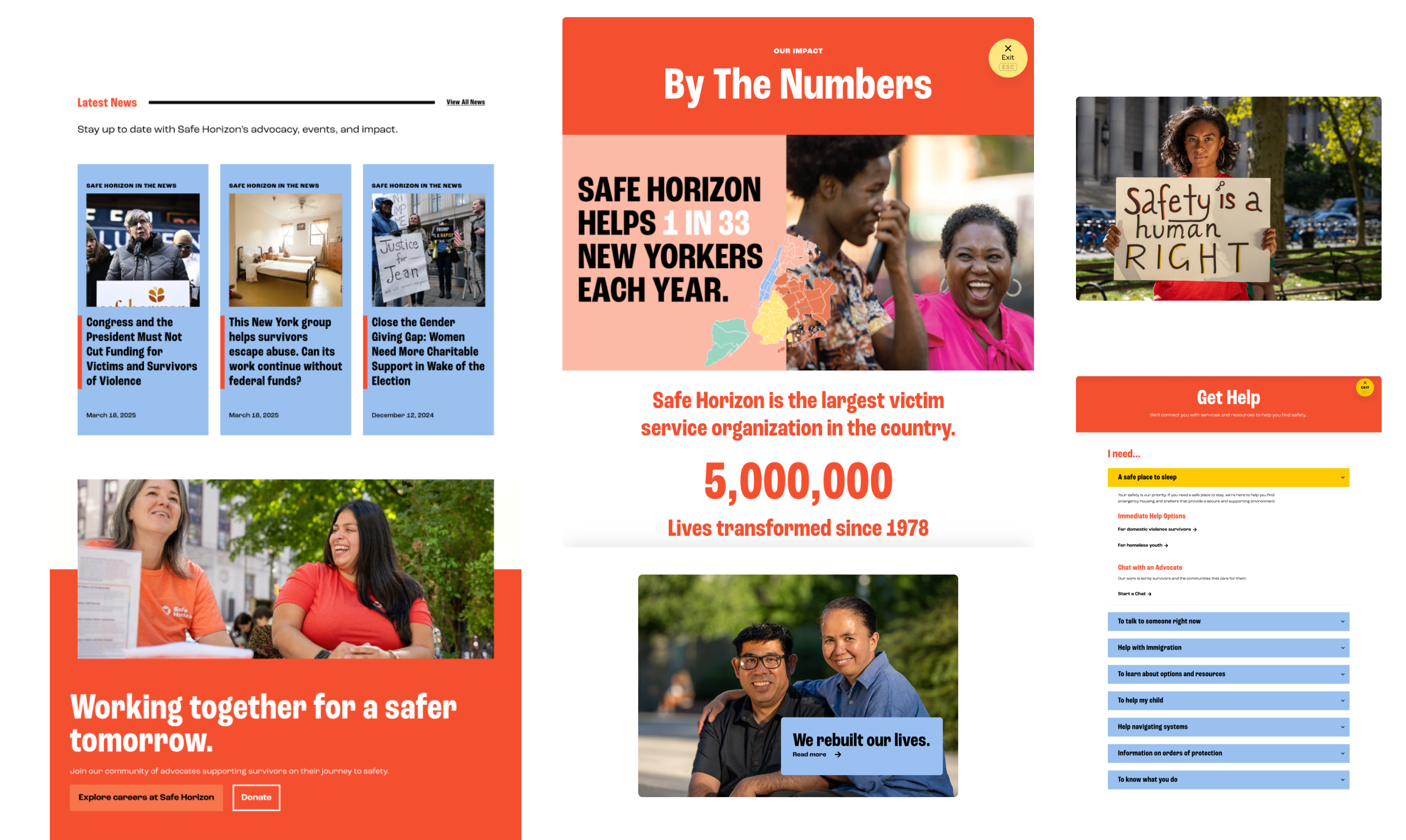
Components for storytelling and functionality.
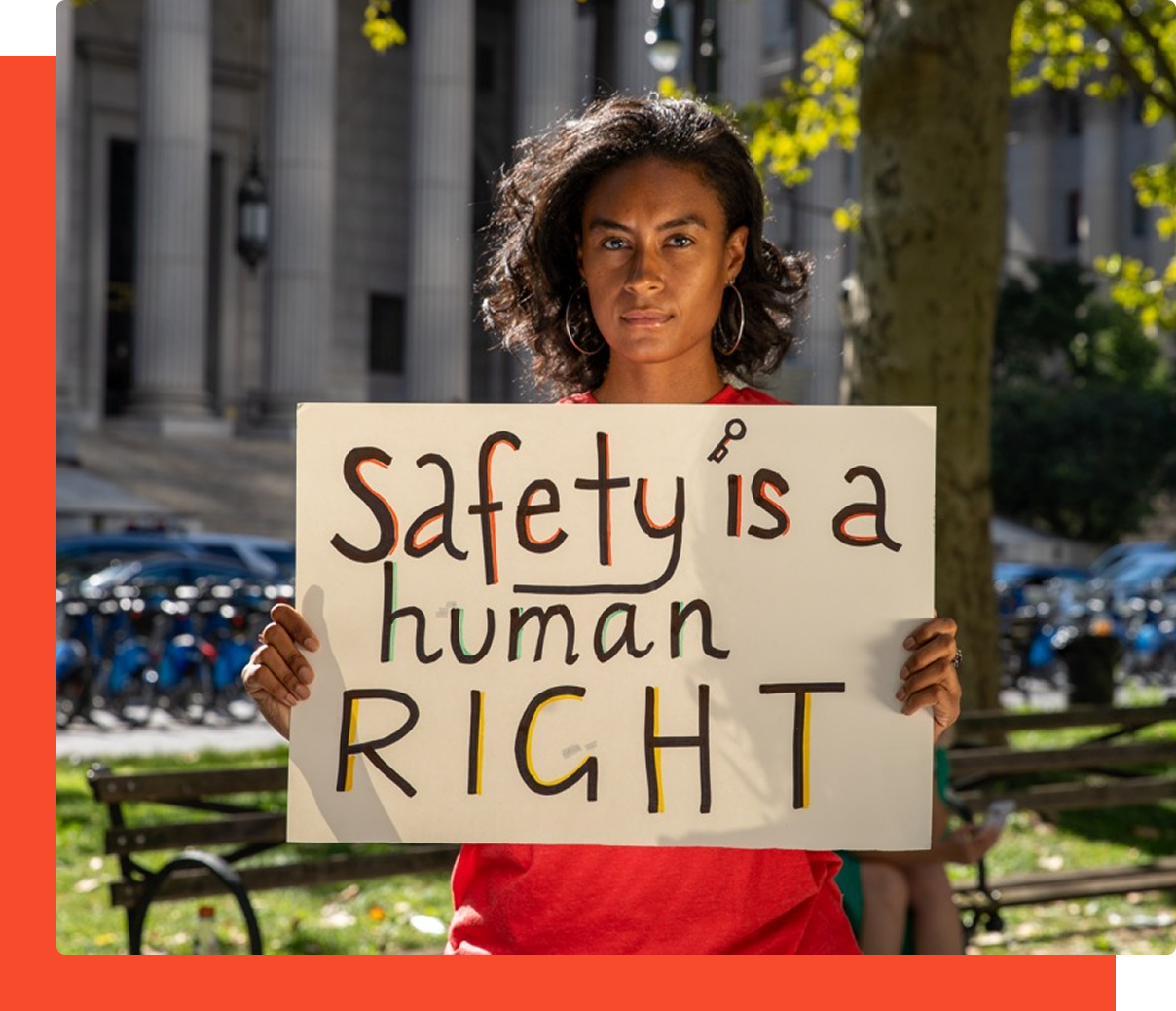
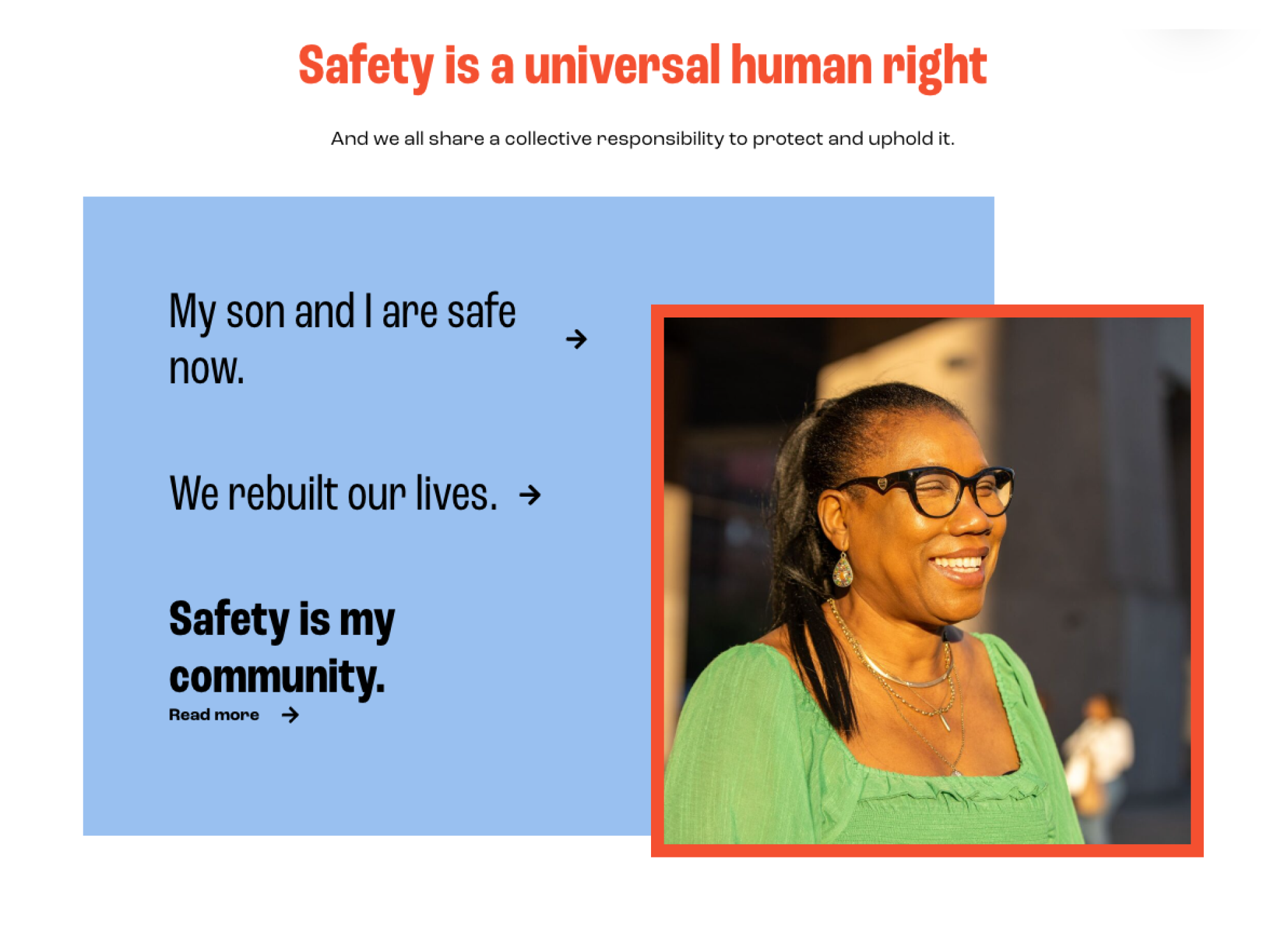
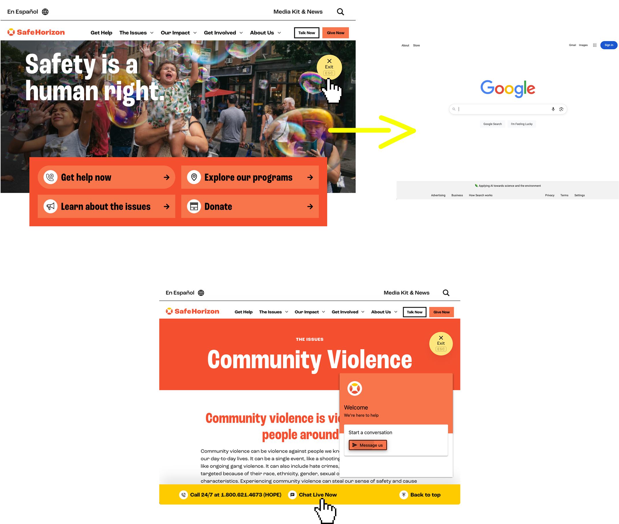
Many people who come to the Safe Horizon website have experienced or are experiencing abuse, which informed the site’s functionality.
From a homepage storytelling block that highlights survivors’ stories, to a quick exit button that immediately sends users to a different webpage, to a live chat — website features work to help users feel supported, in community, and better equipped to navigate unsafe situations.
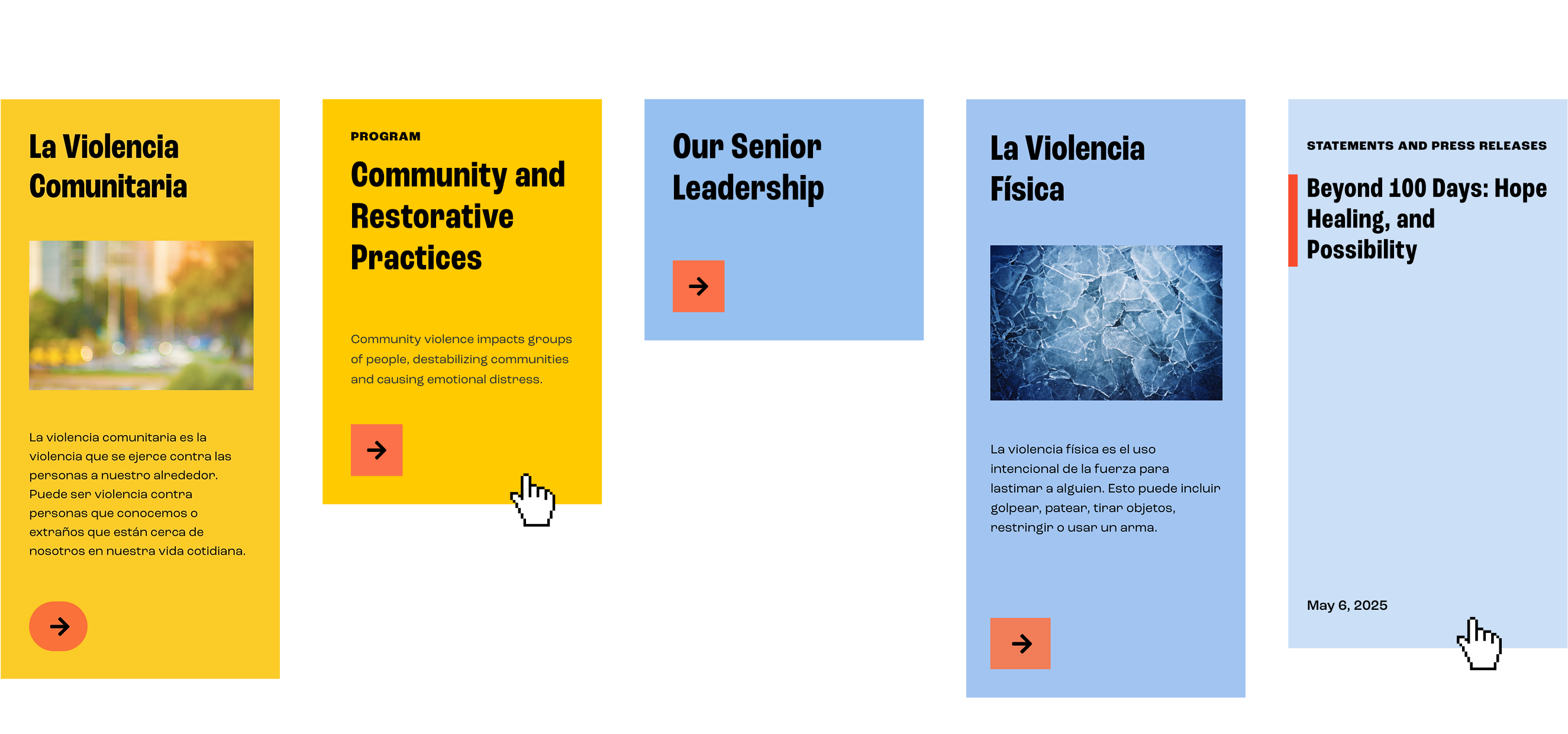
Approaching language.
We knew that Safe Horizon serves people who speak many languages, including Spanish. So, we worked with them to develop an approach to translation that would deliver critical information across languages.
The Spanish-language site is developed as a standalone version with its own sitemap, tagging system, and translated taxonomies, with Safe Horizon in charge of adding translated content. This setup enables the Safe Horizon team to expand into other languages in the future.
Results
The redesigned site launched with an improved editorial experience, clearer information architecture, and a flexible foundation built to support Safe Horizon’s evolving needs. It’s easier for internal teams to build pages, and most importantly, easier for people to find the support they need.
Explore More