Pixel Perfect Project Foundations: Part One of a Series
I used to draw a lot. I never thought of myself as a good artist, but I felt like I had a knack for replicating images, so I turned into a game. I’d say, “let’s see if I can take this small cell from my favorite comic and blow it up into a larger version of itself.” Take this for example:

Alita as drawn by Amy
It came as no surprise to me when I became obsessed with creating responsively pixel perfect websites that represented our talented design team’s work precisely. There was a problem, however. Up until recently front end developers didn’t have a great way to create responsive grids, so we used the tools that we had readily available to us. For example, if you intend to bake chocolate chip cookies with carob, the result is going to be wildly different than if you used chocolate chips! (Carob is never a replacement for chocolate, I don’t care what you say…)
Let’s review our options in the evolutionary order we received them:
- Tables: Tables were originally intended for tabular data created through HTML and nothing more.
- Floats: Since the web was inspired by print, floats were created to successfully wrap text around images. Floats used with inline elements, and specified widths and gutters, have been used for years to create grids. In addition, all browsers support floats. The problem, however, is they can be complex, prone to break, and often contain tricky clearing and
nthitem margin removal between responsive breakpoints. In other words, it’s a lot of work. - Flexbox: As browsers became more supportive of flexbox, many of us got tremendously excited. Flexbox was designed with rows and columns in mind, including created elements within rows and columns that have equal heights and widths. Vertical centering has never been easier, but that’s a whole other blog post. Flex-wrap made it possible for front end devs to create grids using flexbox, so we kissed floated grids goodbye.
- Grid Layout: Low and behold, a CSS solution made with grid styling in mind – finally! As soon as this became widely browser compatible, I jumped at the opportunity to add this to a brand new project implementation.
First things first… after being part of a handful of new site builds from start to finish, it quickly became apparent how important establishing global site containers were at the foundational level. That’s when I created this visual guide:
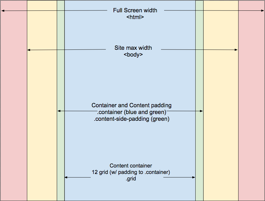
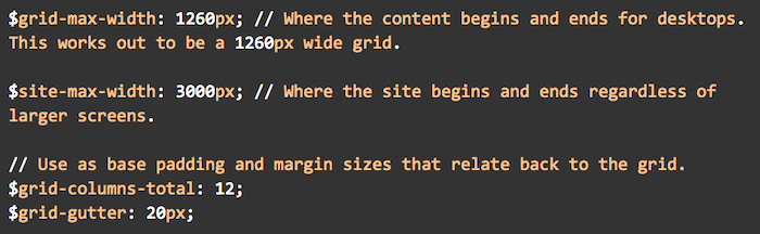
- The Full Screen width is as far as the screen allows. This assumes the site could stretch to infinity, if we had a screen that would allow for that. But we don’t. So, the site boundaries need to be established to something more reasonable.
- The Site Max Width limits how wide the website itself is willing to stretch. In the instance I’ll be talking about, a width of 3000px was set on the
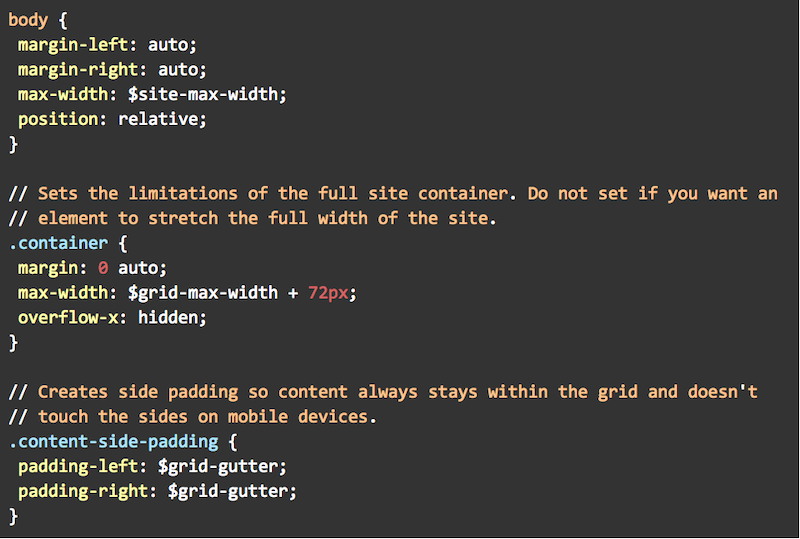
tag and centered usingmargin-left: auto;andmargin-right: auto;. Full-site width elements would live here including but not limited to background images that stretch the full width of the site. - The Content Side Padding always exists, regardless of device. It creates left/right spacing in between elements we don’t want touching the very edge of the screen, and the edge of screen itself. An example of this would be text elements.
- The Grid area is where design-determined columns start and end. Designers typically imagine 12-columns when crafting websites, though the total columns can vary. Planning the full grid area pixel width with a designer right at the beginning is crucial for creating precisely planned grid walls, and perfectly centered elements. Grid Layout also makes creating sidebars super easy to create and maintain as well.
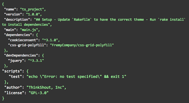
In order to make Grid Layout compatible with IE, it was necessary to add a polyfill to the project. We’re using npm, so a dependency was added like so to the package.json file, and npm update was run to update the package-lock.json file.
Next up, create the grid:
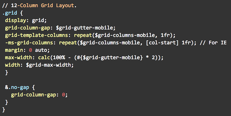
You’re going to see a lot of Sass variables in these code examples, so this might provide a bit of context. (Note: This is a simplified version. This project in particular has 4 grid columns on mobile, and 16 on extra large screens. There were a number of media queries needed to be taken into account too):
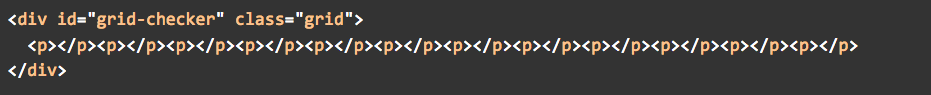
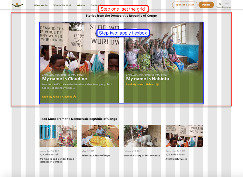
After creating the global grid, it dawned on me that I could create a visual grid fairly easily so my team and I could check our work against the exact line assignments. The idea came to me after I saw my teammate, Marlene, apply a Neat (of Bourbon and Neat CSS libraries) visual-grid to a previous project. So, I added a bit of markup to the html.html.twig template:
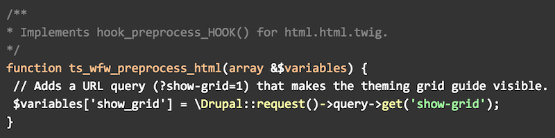
My tech lead, Maria, loved the idea so she came up with a quick way for us to see the visual grid using a preprocess hook in the .theme file. All the team needed to do was apply ?show-grid=1 to the end of any of the site’s urls to check our work and see if it lined up:
Of course, it had to inherit the overall .grid properties (code shown above), in addition to containing its own unique styling, in order to superimpose the visual grid over the top of the entire page.
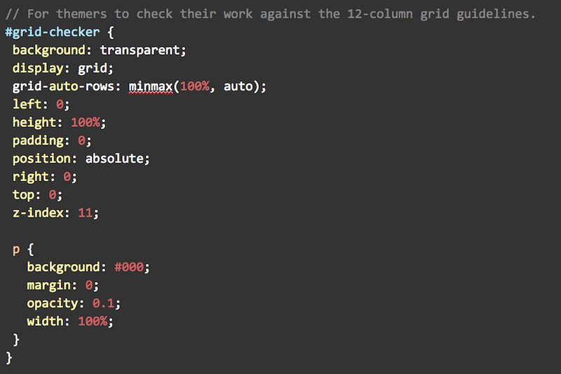
The visual grid looked like this when we were working on our project:
Given that applying CSS Grid Layout to a project was a new experience for me and my team, a couple things needed to happen:
- Create documentation
- Meet with the team to explain how I’ve setup the project,
- Encourage innovation and communication, and
- Go over the documentation
- Encourage updates to the documentation when new tools have been created, and report back to the rest of the team
It was important for the team to know my intentions for applying the horizontal containers and the use of CSS Grid Layout, and to admit that this is new territory and I was relying on all of us to be on the same page, applying the tools in the same way, and finding ways to make our jobs easier and more efficient.
Initially, we started using CSS Grid Layout for specifically layout purposes of an element’s parent wrapper. We are all well versed in Flexbox now, so we applied Flexbox on the child element rows like so:
Later, I discovered a way to generically place child elements into a grid parent without needing to assign each child element a place inside the grid. Check out my Codepen example to see how this might work.
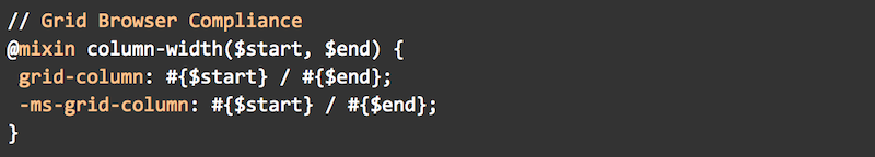
Many of the elements on the site needed grid to be applied first. However these elements needed to be centered as well, like the elements in the screenshot above. CSS Grid Layout comes with a property grid-column that takes two arguments: 1. a start column and 2. an end column. It needed to be IE compatible, so I whipped up this little mixin:
It took my team some acclimating to enter start and end column values for every element in every breakpoint necessary. Admittedly, it was a bit of a mind-bender at times. This especially took some getting used to since applying grid to a parent element will render all its children into a single column out of the box. It wasn’t long before this grid centering code appeared in the project, thanks to innovative thinking from Maria, Marlene, and Jules:
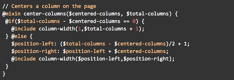
With that, a themer simply enters how many columns the centered element is wide and how many columns exist on the grid at that breakpoint. Voila, centered grid elements in no time flat!
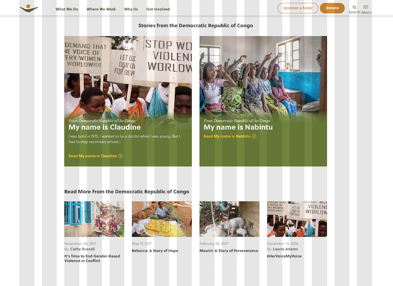
I could go on and on, there’s so much to share. Though designs may have adjusted slightly over the course of the project, the layout and overall elements largely stayed the same. My ultimate goal was to create an exact replication of our designer, Vicki’s, beautiful work. But, I couldn’t do this all by myself. I needed my teammates to be on the same page. And, that they were! Here’s an example of a page I did very little work on. This is also an example of using CSS Grid Layout with a sidebar element with a 12-column across element in the middle of listing items that needed to be placed in fewer columns. One of these screenshots is the design and one is the live site. Can you tell which is which?
This whole experience truly was a team effort. The code snippets I’ve shared with you did not look like that at the beginning. They evolved overtime, and have grown much more beyond the foundation I originally envisioned. To my surprise, my team got so excited about these tools of precision that they helped produce robust mixins, setting global spacing variables. Say our designer wants to change the gutter from 16px to 20px. No problem, change the $grid-gutter variable and all of the elements across the site just fall in line. No more changing every spacing instance of every element across the site. Goodbye frustration, hello efficiency and perfection!
So, if you find you’re as obsessed as I am with creating a pixel perfect responsive experience for your websites, or if you simply want to start using CSS Grid Layout with purpose in your next project, please feel free to adapt these tools into your practice.
Thanks for taking this journey with me, and I hope you look forward to the next blog posts of this series where my teammates discuss other problems we solved in this implementation. Isn’t nerding out with other passionate people the best?!