Accessibility for Teams in a Hurry: Laying a Foundation

Accessibility is a complex topic and can feel overwhelming when you’re getting started. Our goal with this series is to help you take those first few steps, and share some of the things we’ve learned about bringing accessibility into our processes across teams and departments.
Start by making your focus progress, not perfection. You don’t have to be an expert to start making your site more accessible. If you fix one button, that’s progress. This is a journey and change takes time, and hopefully some of the things we’ve learned can help you along the way.
Accessibility is not nice
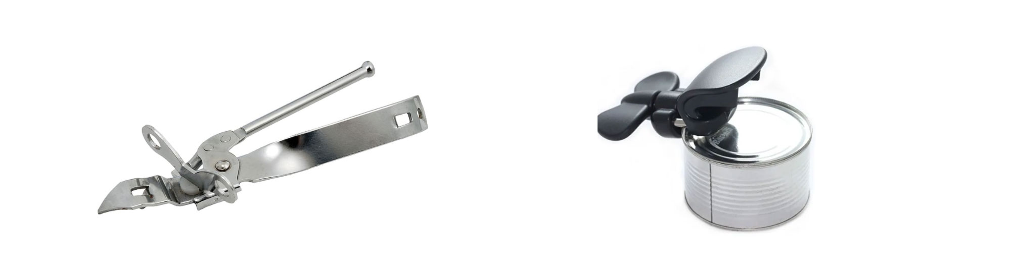
Left, right handed can opener, Right: Left handed can opener
Before we talk about what accessibility is, let’s take a look at what accessibility is not. Accessibility is not nice. To demonstrate what this Kat Holmes quote means, here are two images of can openers. One was designed for right and left-handed people. One was designed for people who are right-handed. The person who designed the one that works for more people didn’t do it as a feel good activity or out of the goodness of their heart. They recognized a product was excluding people and created a product that’s usable by more people.
“Accessibility is not nice.”
— Mismatch, Kat Holmes
Similarly, accessibility isn’t a feel-good activity. It’s taking the time to identify and confront the exclusion you’ve unintentionally built into your site. No one builds an inaccessible site on purpose in the same way that the person who designed the right-handed can opener probably doesn’t have a grudge against left-handed people. We’re human and we build things for people assuming others are exactly like ourselves. A great thing about Accessibility is that it forces us to learn about how other people use the things we make. And that in turn makes us better at making things.
What is accessibility?
Understanding accessibility on the web starts with understanding disability. A common misconception is that accessibility is just for folks who are blind.
When we talk about an accessible website, we’re talking about one that works for people who:
- Have low vision, no vision, or color blindness
- Have speaking and cognitive disabilities
- Are Deaf
- Are neurodiverse
- And people who have mobility-related disabilities
25% of people have a permanent or temporary disability, so accessibility is not charity for a small group of users. It’s good design, content and coding practices to better serve your entire audience.
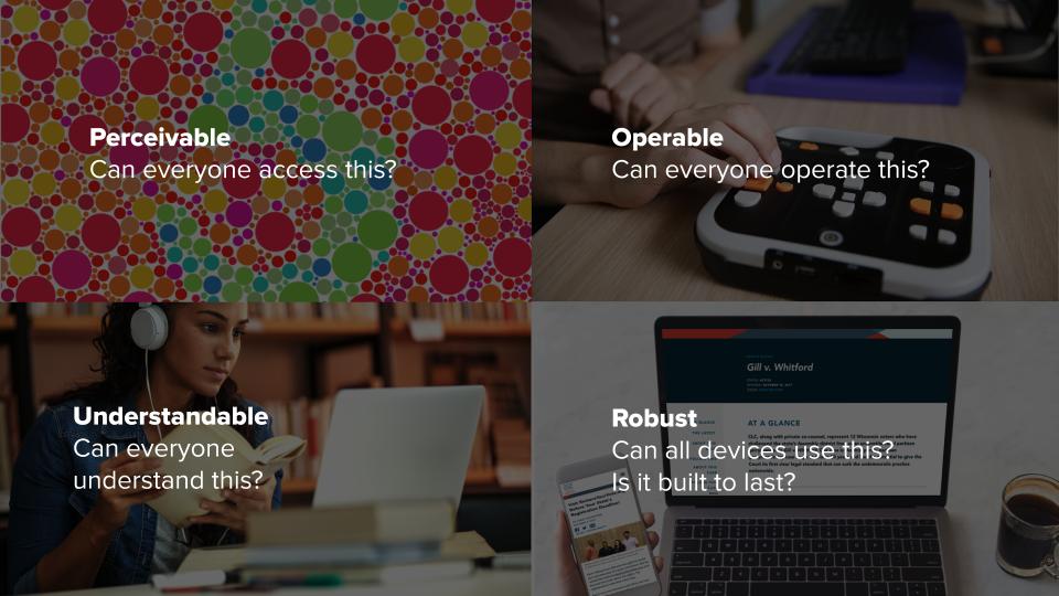
There are 4 principles of accessibility:
- Perceivable: Can people perceive the content with their available senses?
- Operable: Can people operate this?
- Understandable: Can people understand what it does
- Robust: Can all devices use this?Is it built to last?
Measurement & Compliance
The internationally used standard is the Web Content Accessibility Guidelines (WCAG) defined by the W3C (world wide web consortium). These are referred to as the W.C.A.G. or Wuh-kaag.
These standards have three levels: A, AA, AAA. AAA can have a bigger impact on design and be more challenging to implement. That’s why the AA standard is widely accepted as the standard level of conformance.
In the United States the federal government doesn’t require websites to meet a certain conformance level unless they’re receiving federal funds. Section 508 now points to WCAG. If you’re receiving federal funds, you must meet WCAG 2.0 AA.
For organizations that are not government funded, the Americans with Disabilities Act requires that “places of public accommodation” be accessible. Federal judges have overwhelmingly ruled that the internet is now a place of public accommodation and businesses as well as nonprofits can’t discriminate based on disability.
2018 and 2019 have been record breaking years for web accessibility lawsuits, with filings happening every hour, so it’s important to prioritize accessibility on your site and to build it into your processes because the modern web is becoming increasingly accessible.
Testing
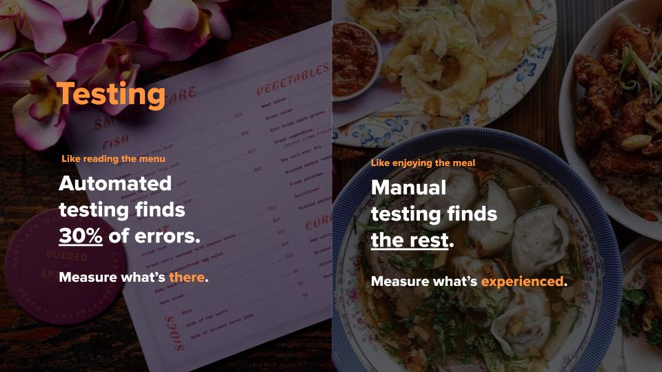
Regardless of the tools you use you need to include both manual and automated testing. Manual and automated tests are like reading a menu vs enjoying a meal. For examples of tools, check out the resources listed at the end of this post.
Automated tests:
- Measure what’s there or not: the ingredients.
- Can’t measure the user experience.
- Only catch about 30% of errors.
Manual tests determine whether the site does what it’s supposed to do and what the experience is like.
Manual testing includes navigating the site by:
- Using a keyboard only (with no mouse or trackpad.)
- Zooming into the screen to 400%
- Using a screen reader
Example Process
Once you’ve picked your testing tools, decide who’s responsible for using them and when. Here’s an example workflow for a simple button.
- The Designer: Establishes and tests color combinations
- The Developer: Tests after building it
- The Designer: Tests the live component during QA
- Project Managers: Do a final test before launch
That might seem like a lot of testing, but we’ve discovered broken forms, donate buttons that didn’t work on mobile and all kinds of bugs by doing accessibility testing.
To Summarize
- 25% of people have a temporary or permanent disability.
- WCAG 2.1 AA is a standard most commonly used internationally to measure accessibility.
- Nonprofit, for-profit and government organizations cannot discriminate based on disability.
- 2019 had more than 1 website accessibility lawsuit per hour of every day.
- Manual and Automated tests should be used to measure the accessibility of your site.
- Bring testing into your process and build in redundancies to make sure your site is accessible.
Resources
-
Accessibility Impacts all of Us
Infographic and statistics from the CDC -
The business case for Accessibility
Case studies with great stats for convincing stakeholders why accessibility has to be a priority. -
Mismatch: How Inclusion Shapes Design
A great book and blog about accessibility, inclusion and design