Accessibility for Teams in a Hurry: Color Contrast

Making accessible design decisions starts by establishing an accessible color palette. Defining a color palette can be really exciting as it sets the tone of the experience, yet it’s a fragile part of the process. People attach a lot of emotion to color. If you combine that with branding considerations, this part of the process must be handled with care and can often take time to get right.
There are some key considerations when creating a color palette for your website. Some are as simple as making intentional design choices and others can involve multiple stakeholders.
Define the Palette
An accessible color palette has sufficient contrast for legibility and interactions. It’s more usable for people with low vision or color blindness and makes information more legible for everyone. Sometimes brand colors have already been established that might not be accessible for digital applications. This requires working with a brand team or stakeholders to create an accessible, digital version of an existing palette.
Decide What Colors are for Decoration vs. Information
Consider how the color is being used within your system. Once you define your palette, consider which colors can be used just as decorative elements rather than using them to communicate key information. This allows you to retain color combinations with lower contrast or similar values without compromising your site’s accessibility.

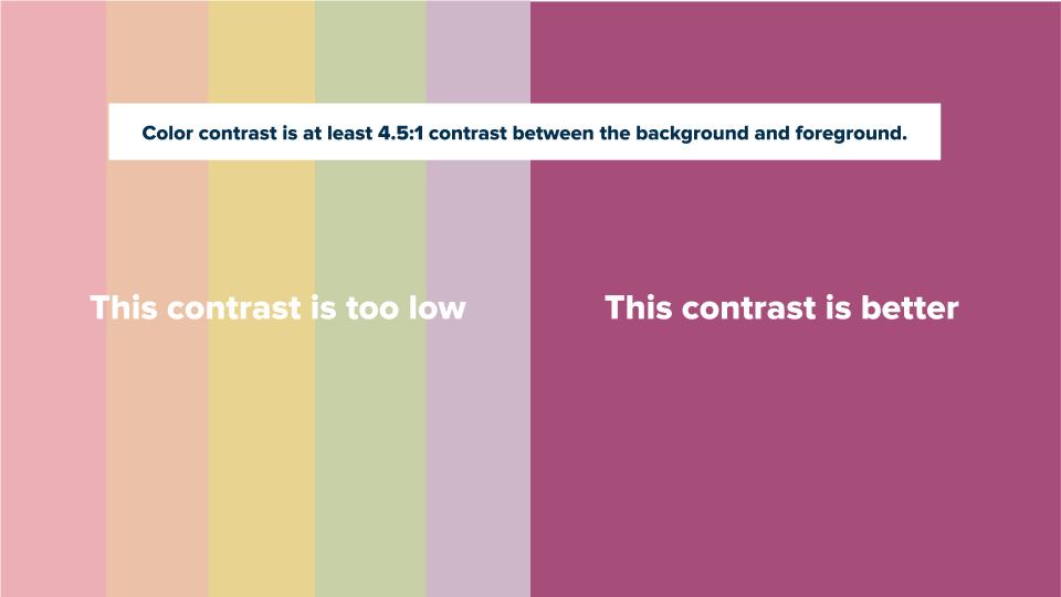
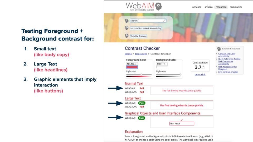
When we talk about contrast our goal is to make sure information can be read, which means there’s at least a 4.5:1 contrast ratio between the foreground and background colors.
To test contrast while you’re creating designs, there are plugins out there for tools like sketch, but one of our favorite tools is WebAIM’s website where we can check contrast for multiple uses. For example, a pairing might not work for small text, but would work well for symbols and headlines.
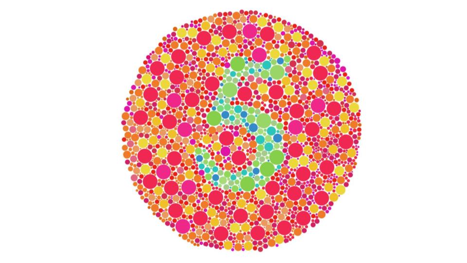
In addition to contrast, colors with too similar value aren’t discernable as a way of communicating information for people with color blindness and are difficult to read for all audiences.
Establish Action Colors and Create a Style Guide for Developers and Site Administrators
Color meaning should be applied consistently. Users often associate color with meaning. That means it’s important to communicate each color’s purpose to your dev team and the site admin by creating style guides.
A Sample Workflow:
| Primary | Secondary | When | Tool Used | |
|---|---|---|---|---|
| Color Contrast | Designer | Developer | Primary: Design
Secondary: | Primary: WebAIM
Secondary: |
To Summarize
- Define your palette
- Decide what colors are for decoration vs. information
- Test your color combinations
- Establish action colors
- Create a style guide for developers and site admins
Resources
-
WebAIM’s color contrast checker
Test your color combinations for a 4.5:1 contrast ratio. -
No Coffee Chrome extension
Simulate how the colors on your site will look to someone with colorblindness -
Color Safe
A free website with an accessible color palette generator.