Accessible Cards + Duplicate Links

Accessible Cards + Duplicate Links
 Duplicate link errors are common whenever you have multiple links on one element that go to the same place. This accessibility issue not only creates a messy list of links for your page, but it isn’t great for SEO either.
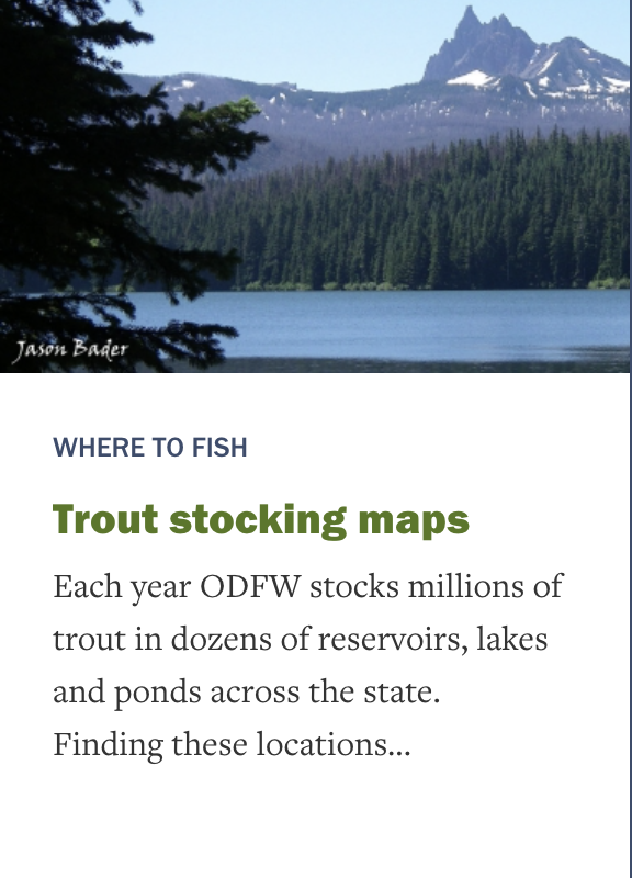
In this card example, the image and the headline text “Trout stocking maps” are both links. If a person clicks on the image or the title text, they are taken to the new page.
I refer to these as a “card” because we usually see multiple in a row all laid out like, well, cards.
Why it’s a problem
The alt text has nothing to do with the link destination.
If I’m using a screen reader and get to that element, I can tab to the image link and if the image has good alt text I hear it read to me. In this case it says “Link: Marion Lake”. But this link takes me to the Trout stocking map.
The extra link creates a confusing experience for the user and adds extra stops along the way.
If I tab again, I land on “Link: Trout stocking maps.” This is a good label for this link, but now I’ve encountered it twice. And I have to tab through two links on every card, doubling the time it takes to get through the page.
Our end goal is for the user to be able to get to the article if they click on the image or title, but without the error. This means it shouldn’t conflict with other links that might exist on the card. Here are a few ways we can approach this.
Option #1: Wrap the whole thing in an anchor, and give it a clear label.

Example: “Find a Foodbank” cards Wrapping multiple fields in a single anchor tag minimizes duplicates and allows the links to behave as expected.
Here, the logo and the link text are wrapped in an anchor tag that has an aria-label.
Without the aria-label, the link would be read by screen readers as:
“Link: Foodbank of Alaska logo Foodbank of Alaska, Inc”
With the aria-label, the link is read as:
“Link: Foodbank of Alaska”
Example of an anchor tag wrapped around multiple fields:
<a aria-label="Food Bank of Alaska, Inc." href="/find-your-local-foodbank/food-bank-of-alaska-inc.html">
  <img border="0" alt="Food Bank of Alaska, Inc. logo” src="FoodBankLogo_3_275w.jpg">
  <p class="name">Food Bank of Alaska, Inc.</p>
</a>
Pros:
When a user clicks on the logo or the text, the link is triggered.
There are no duplicate link errors when I run the WAVE tool.
Cons:
This solution requires the duplicate links to exist side-by-side.
If another link is between them, it doesn’t work. (Although, this is a good reason to reach out to your designer to see if that can be changed.)
Option #2: A Simple Fix for Clicks.
Example: Trout stocking image and title
In this example, I have an image and a green title that should both be links. But because they have content between them, wrapping them in a link isn’t a great option. Drupal can also get a bit grumpy about wrapping multiple fields in an anchor tag – it’ll wrap each field in its own anchor, which often makes your duplicate link issue worse.
I stumbled across a solution for this on bbc.co.uk that allows the user to tab through the article headings, or click on any article element to get to the full story. Here’s how it works.
What to do
1. Make the title text a semantic link.
// Semantic link in the tab index, available for keyboard navigation with a clear label
<a href=“/trout-stocking-maps”><h3>Where to fish</h3></a>
2. Add an invisible anchor tag and position it over the image (or the entire card) you want to become the link.
// Invisible link, available to click on, but not to screen readers and keyboard navigation
<a href="/trout-stocking-maps" style=“position:absolute; left: 0; top: 0; width: 100%; height: 100%”></a>
3. Tell assistive technology to ignore your invisible link by giving it the properties aria-hidden=“true” and tabindex=“-1”. (This is only a good idea when the content is available elsewhere on the page.) In this case, we’re hiding a duplicate of semantic, accessible code.
<div class="card" style=“position: relative”>
  // Invisible link, available to click on
  <a aria-hidden="true" tabindex=“-1” href="/trout-stocking-maps" style="
    position:absolute; left: 0; top: 0; width: 100%; height: 100%"></a>

  <div class="card-image">
    <img src="009_marion_lake_bader_odfw.jpg" alt="Marion Lake">
  </div>

  <div class="card-body">
    // Semantic link in the tab index, available for keyboard navigation
    <a href=“/trout-stocking-maps”><h3>Where to fish</h3></a>
    ...
  </h3>
</div>
This approach makes all of these desired interactions true:
- When a person tabs through the cards using keyboard navigation they only have to tab through each title once, as the focus goes from title to title.
- When a person is using a screen reader, there aren’t extra links cluttering up the list of links on the page. aria-hidden=“true” tells the screen reader to ignore the invisible link.
- When someone clicks on the image (or the whole card, depending on your design) they will trigger the invisible link, creating the desired effect.
- The image with alt text is still available to screen readers. Yes, you could add aria-hidden=“true” and tabindex=“-1” to the link wrapped around the image, but then the image is no longer available to screen readers at all. This approach solves that problem.
Remember to Style Hover and Focus States Accordingly
If you put the invisible anchor at the beginning of your markup, you can still use SASS to set your hover and focus styles for the card.
Be sure to add hover styles for both links, and focus for the semantic title link.
.invisible-link:focus,
.invisible-link:hover {
   & + .h3 {
     color: blue;
     text-decoration: underline;
  }
}
Option #3: Get Minimal
The last thing to consider is: does this need to be a link? Sometimes as devs, we like to insert extra functionality that’s actually not that useful for folks using our sites.

On this element, there’s a link around the icon as well as around the title next to it. It’s not very intuitive to click on the icon as a link, and it triggers a Duplicate Error warning in WAVE.
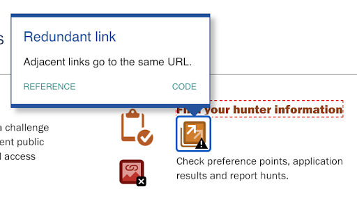
A WAVE tool error shows a redundant link error.
Rather than finding a workaround for this error, I’d recommend just removing the link from the icon. It allows folks to access the information with any extra clutter while using known patterns. Plus, deleting code is my favorite kind of fix.
Summary
Wrap the whole element in a link if you can.
And give it an aria-label or aria-labelledby so the screen reader doesn’t read the entire contents of the card as the label.
Think about the ways people are going to use your links.
- Is this a nice, clear experience :
- using a keyboard?
- Using a screen reader, like VoiceOver?
- Clicking on the elements that appear to be links?
- Does it have visible hover and focus states?
Get minimal.
Sometimes the most clever workaround is writing clear semantic code. If I find myself getting tricky, my code is probably going to be tricky to maintain as well.