Association of Corporate Counsel
Easy-to-use resource library with powerful search features.

The Initial Problem
The Association of Corporate Counsel [ACC] is a global bar association that promotes in-house counsel’s common professional and business interests through information, education, networking opportunities, and advocacy.
As an essential source of resources for lawyers, they came to us facing significant challenges with their online resource library in terms of search functionality, navigation, taxonomy, and overall user experience. These issues resulted in users struggling to find resources, sponsors not receiving the visibility they were expecting, and ACC lacking insights into resource engagement.
Our goal was to optimize the resource library within their existing system to address those gaps.
Tuning the Engine
We worked closely with the ACC team to configure Solr so that users get the results they’re looking for across a wide range of terms and phrases. The system doesn’t just search for exact phrases; it understands user intent. This means the system provides a balanced mix of relevant results alongside many results–which is especially helpful for complex queries.
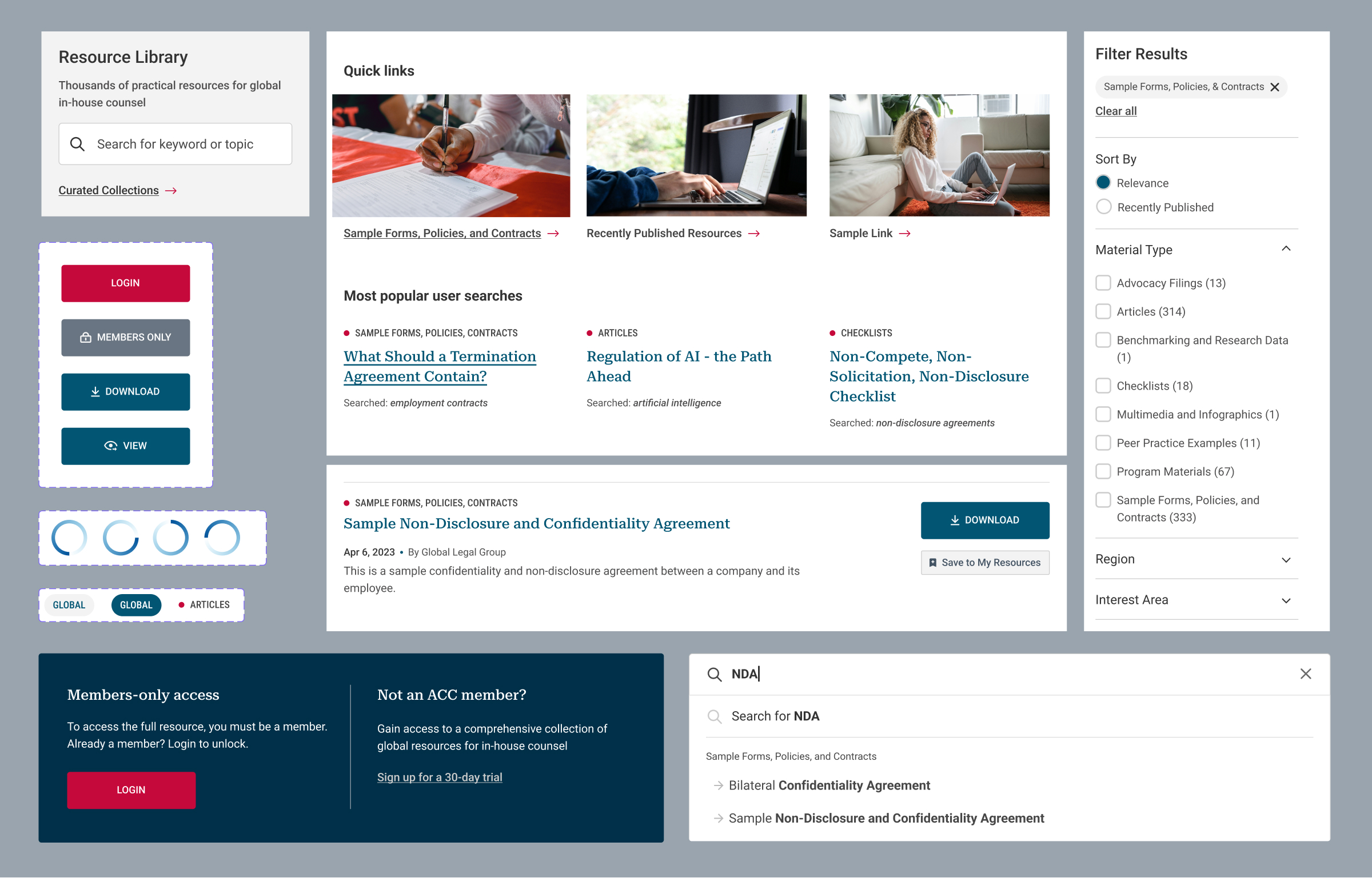
Once the core search was optimized, we focused on smaller, yet important, aspects of the experience. We implemented an autocomplete feature and spell check, and introduced synonyms so users could still find relevant materials with variable search terms. We also refined the search algorithm to prioritize results differently based on age of content, material type, and field type, boosting certain fields, like keyword fields, that ACC deemed most important. Finally, we improved search performance by using pre-loaded results for suggestions, cleaning up the search index by removing things that were never searched, and cleaning up fields.

Search UX/UI Updates
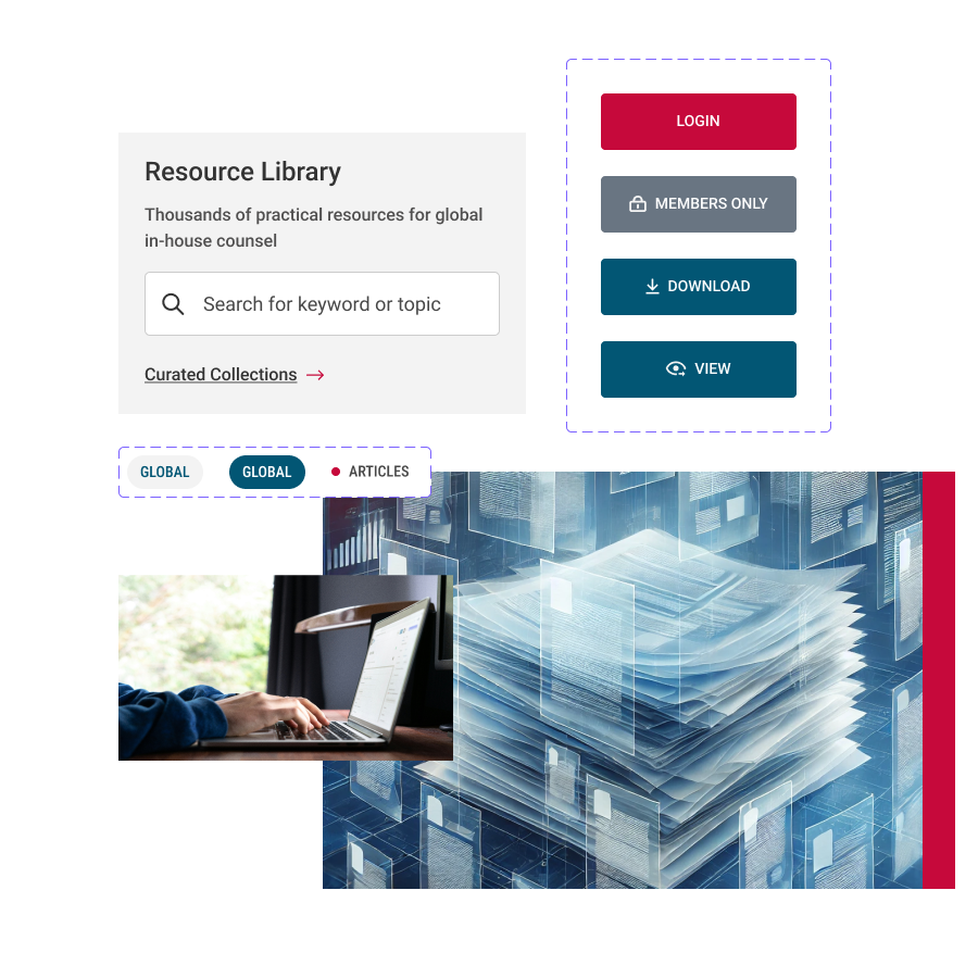
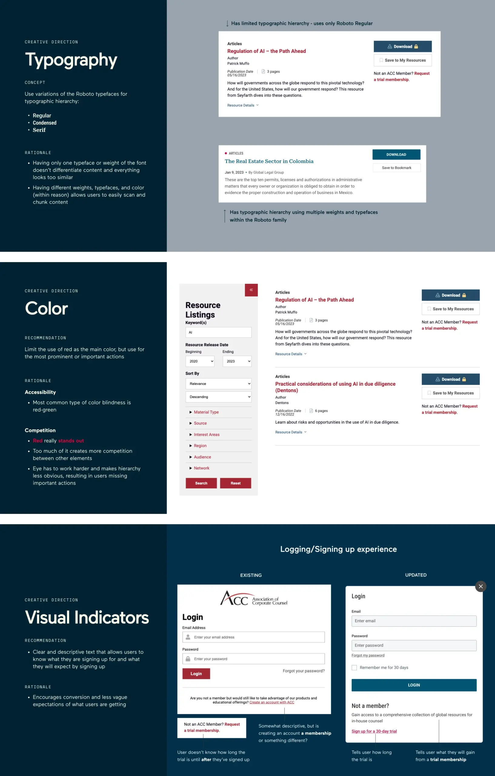
In parallel with enhancing search functionality, we restructured the navigation system for a more intuitive user experience. We replaced the mega navigation with a streamlined approach, featuring quick links to featured content, curated resource collections, and trending topics. We also cleaned up the filter sidebar, redesigned the resource detail page, and made subtle changes to color and typography to create consistency and patterns for clearer visual indicators.

Results and Early Wins
Since the September 2023 launch of the new Resource Library, more users have been able to find the resources they need. Page views, session duration, and conversions have all increased while the bounce rate has decreased, indicating fewer users are leaving the site after single page visits.
- +67% engagement rate
- +35% total active users
- +535% Increased Downloads
- +45% Increased Pageviews
- +124% Increased Total Keyword Searches
Explore More

