Center for Strategic and International Studies
An indispensable digital resource for global policy and media influencers.
Serving Up Relevant Content
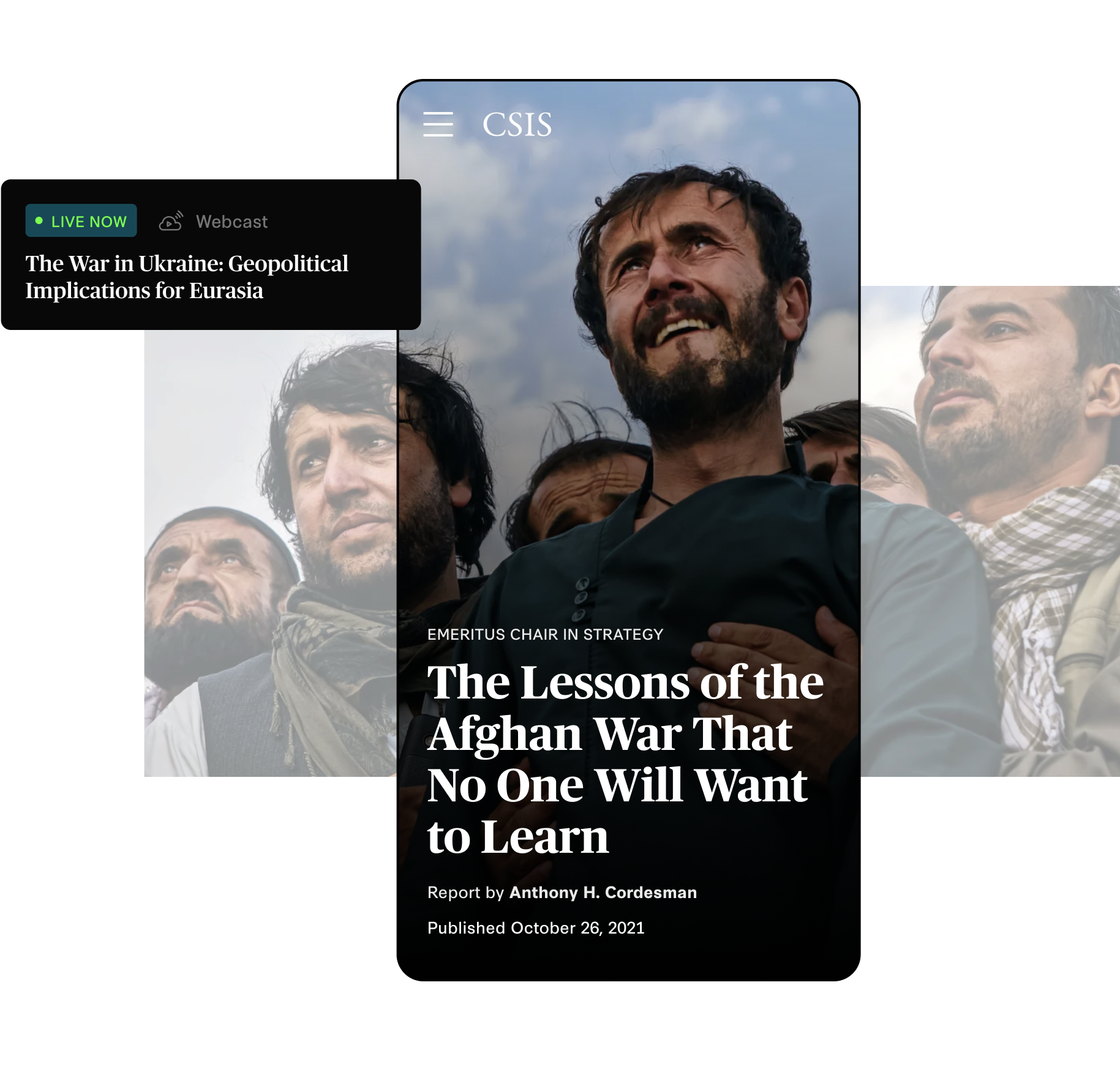
The Center for Strategic and International Studies [CSIS] needed to (1) elevate standalone, emergent content for new users coming directly from organic search and (2) serve returning users already familiar with CSIS with relevant content, quickly.
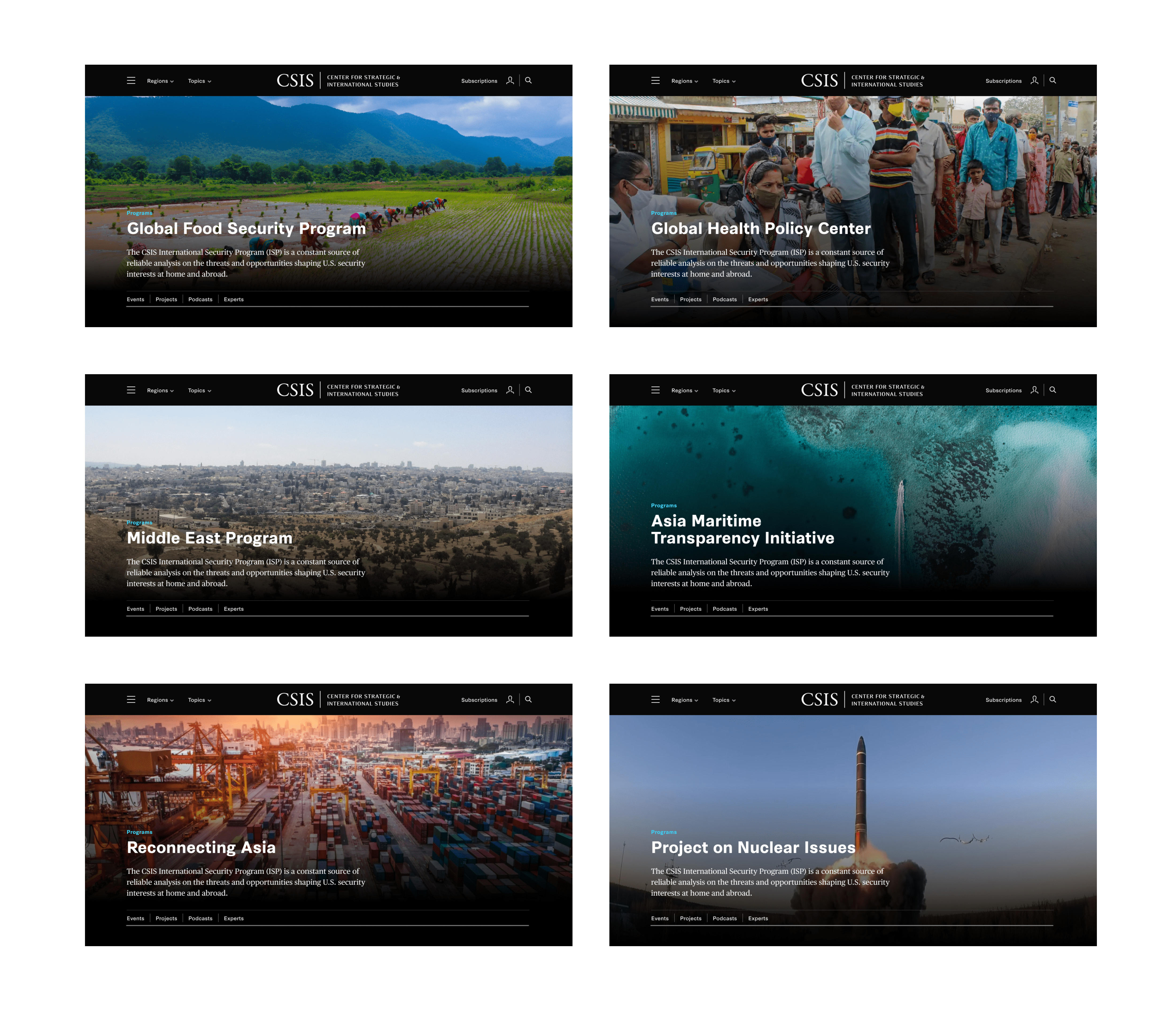
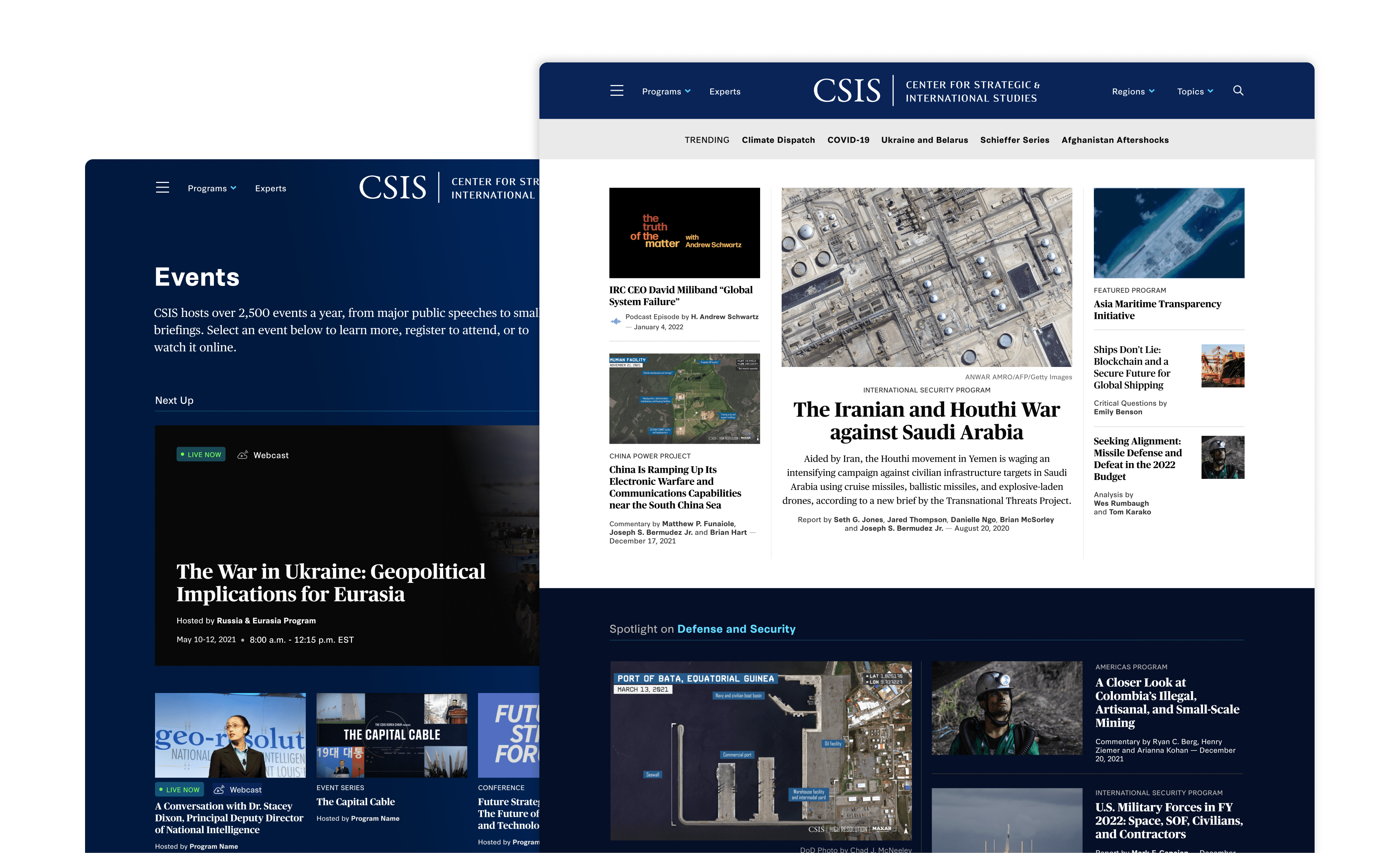
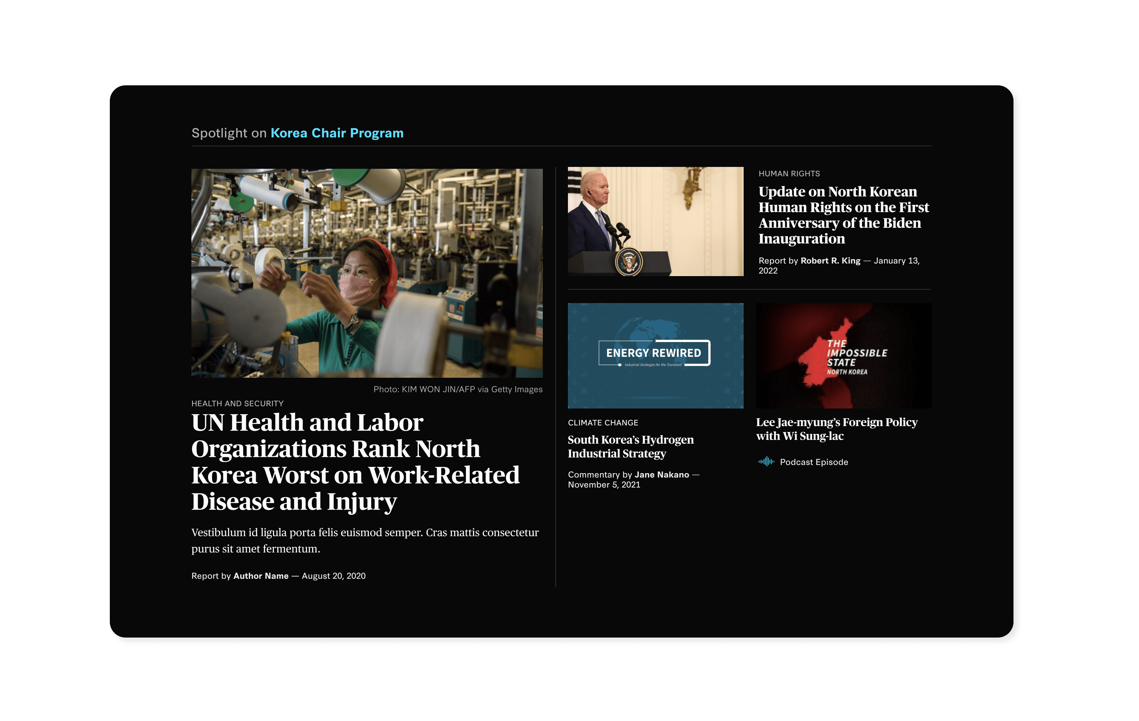
In the redesigned site, filterable and dynamic content blocks populate fresh content throughout the site automatically, while dedicated program pages serve as hubs for specific topics and regions for users who know where they need to go. Regardless of user type, media queries, contact information, and an immersive navigation present CTAs that make their next step–whatever it may be–quick and accessible.

Future-focused Content Editing
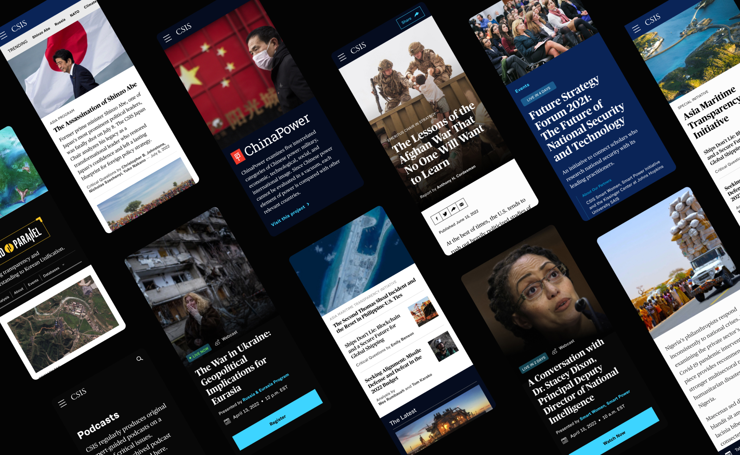
To create common spaces for center-wide content (analysis, reports, events, etc), with program areas that felt more bespoke, we used a combination of Layout Builder with custom plugins to create flexible components. Each component has enough unique variations that it can be used across multiple locations of the site, and content authors can quickly build and preview content grids in a variety of layouts.
The backend also exists as self-contained components–meaning the backend logic, configuration, and templating logic are stored together, allowing the site’s functionality to be “portable”. Now, frontend updates are straightforward (for example, the entire typography system on the site could be updated by making changes in one file), and all frontend building blocks have the ability to be reused on a microsite with a completely different backend–making this site the ultimate example of being future-proof.
Feature highlight:
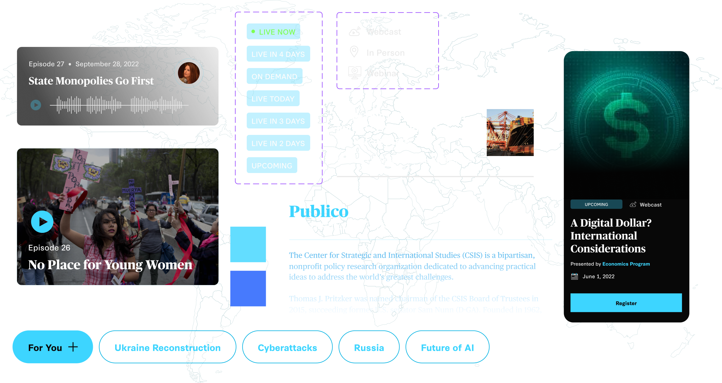
Event Registration Integration
On top of releasing reports and running countless global programs, CSIS also produces nearly 25 events every week. Having an event registration system that seamlessly integrates with their existing software is critical for their team to keep data centralized and easily trackable.
In their new site, a custom-built integration makes it simple; when a user registers for an event, relevant registration information is passed directly to Pardot and Salesforce. But this works the other way, too. CSIS can view registrations right within Drupal, and easily manage communication and event messaging using their existing Pardot setup. Their new event registration system now supports them in managing all the different types of events they run–from in-person conferences, to virtual series and beyond.
Results and Early Wins
CSIS’ new website is a source of savvy and interactive content that invites users to tap into both brief, independent takeaways as well as in-depth analyses. Content planning, staging support, SEO prep and a measurement tracking plan will allow us to gather robust performance reporting to track site success–and iterate the site alongside the CSIS team to make sure it’s always meeting the moment.
What We Did
Strategy
- Discovery Workshop
- Stakeholder Research
- Personas and User Journeys
- Information Architecture
- Measurement Planning
- SEO and Google Analytics
Design
- Creative Direction
- Visual Design and UI
- Flexible Page Comps
- Prototype
Engineering
- Content Migration
- Technical Planning
- Accessibility Optimization
- Digital Ecosystem Mapping
- Custom Drupal Development
- Custom Salesforce Integration

Explore More
