Oregon Museum of Science and Industry
A flagship website for one of Oregon’s most famous museums encourages digital exploration.

Endless Discovery
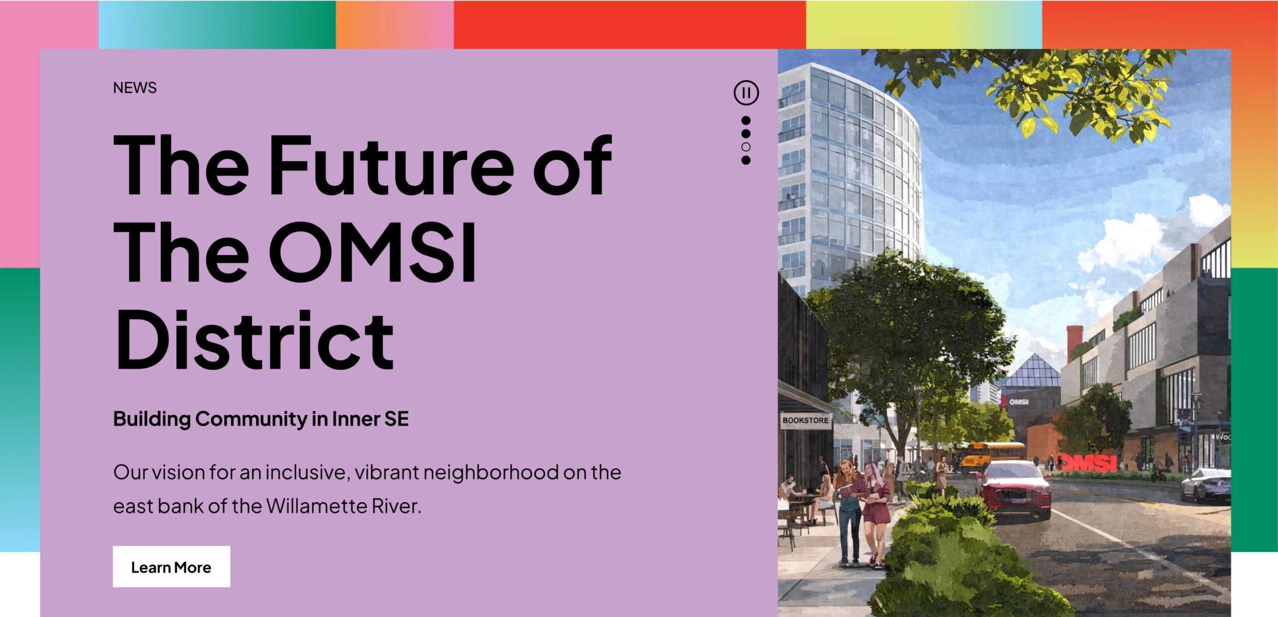
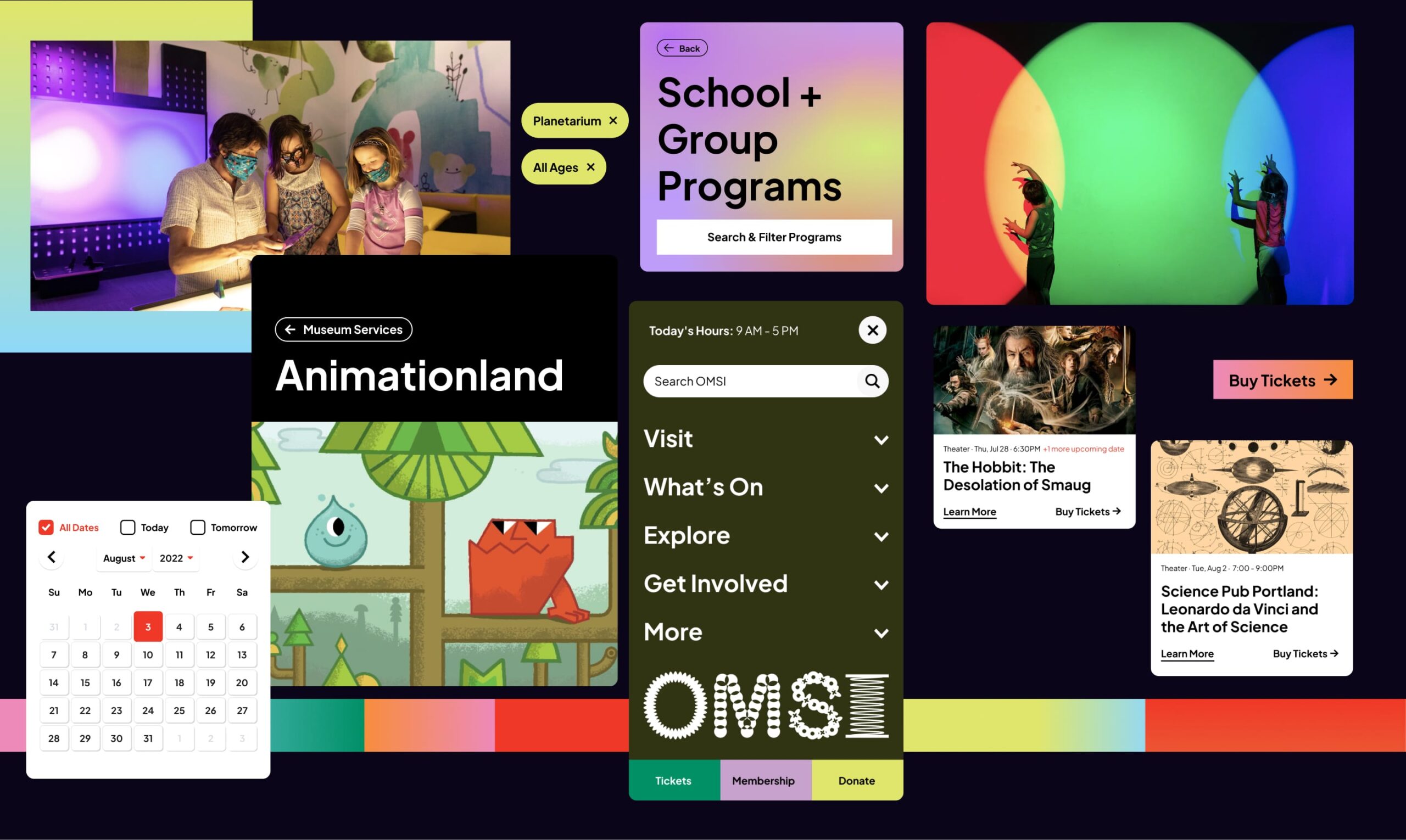
As one of the leading museums and educational institutions in Oregon, getting visitors to explore the constantly-evolving exhibits and events the Oregon Museum of Science and Industry [OMSI] offers was critical to the website’s success. Our work was to redesign the site with as many entryways to content as possible–to build a site that users can explore and never hit an endpoint, but be continuously exposed to more.
What’s On
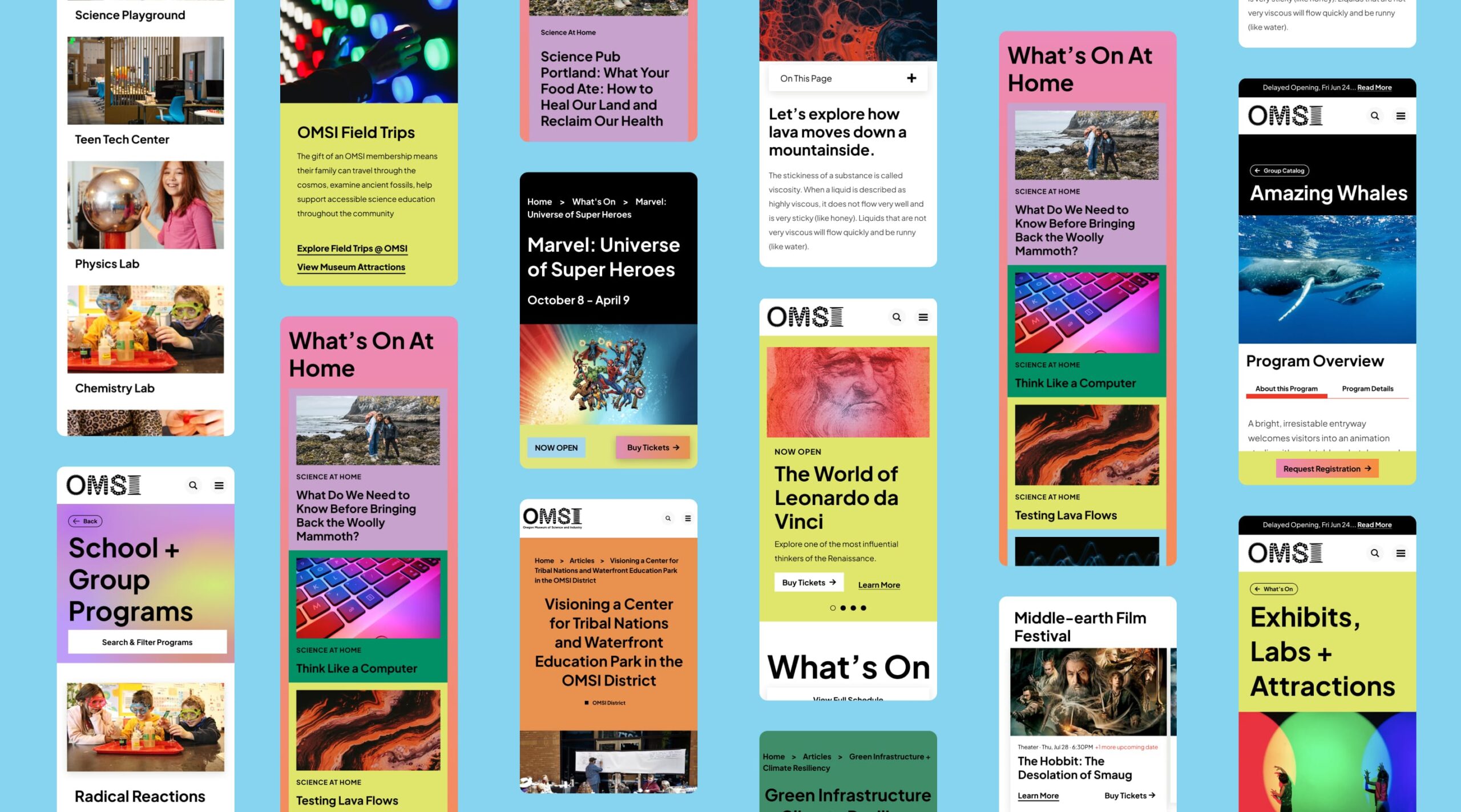
Living in both the main navigation and underneath the flexible homepage hero, ‘What’s On’ provides users access to a snapshot of all current activities, with the ability to search and filter. When users view an exhibit detail page, headline content is always paired with pathways for deeper exploration (like articles and events that complement specific exhibits, or blog posts that promote the new OMSI district).
The search and filter experience is also extremely shareable. For example, if an OMSI educator wants to share resources with a kindergarten teacher, they can filter search by kindergarten focused resources and directly copy the link to send the teacher already-filtered search results.
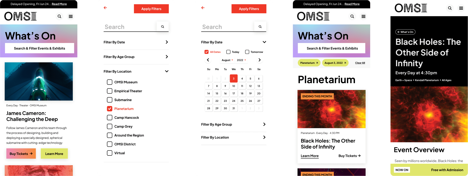
Feature highlight:
Ticketure Integration
Tickets and membership for OMSI are handled by Ticketure. Prior to the redesign, when a user wanted to buy tickets they would immediately bounce off-site.
We set up WordPress to sync up with Ticketure when events were created, allowing editors to manage event details directly in WordPress. Now, when a user wants to buy a ticket they’re still bounced over to Ticketure eventually–but we moved this inflection point down the line tremendously. This approach maximizes a users exposure to on-site content, giving them more chances to interact with membership CTAs, learn more about other events, or add additional tickets to their cart.
Results and Early Wins
The new omsi.edu better showcases the breadth of the museum’s work, increases accessibility, and provides their team an editorial workflow that allows content editors to easily keep up with an always busy publishing schedule. Most importantly, it allows visitors to experience the learning and endless discovery that is central to OMSI’s mission.
From pre-launch to 3 months post-launch, this site saw:
- 4.6x increase in traffic
- 6.8x increase in total page views
- Increase in pages viewed per session
- Bounce rate drop by 15%
- Average session time increase by 5 minutes
What We Did
Strategy
- Discovery Workshop
- Stakeholder Research
- Content Strategy
- Engagement Strategy
- Landscape Analysis
- Measurement Planning
- Information Architecture
Design
- Wireframes
- Creative Direction
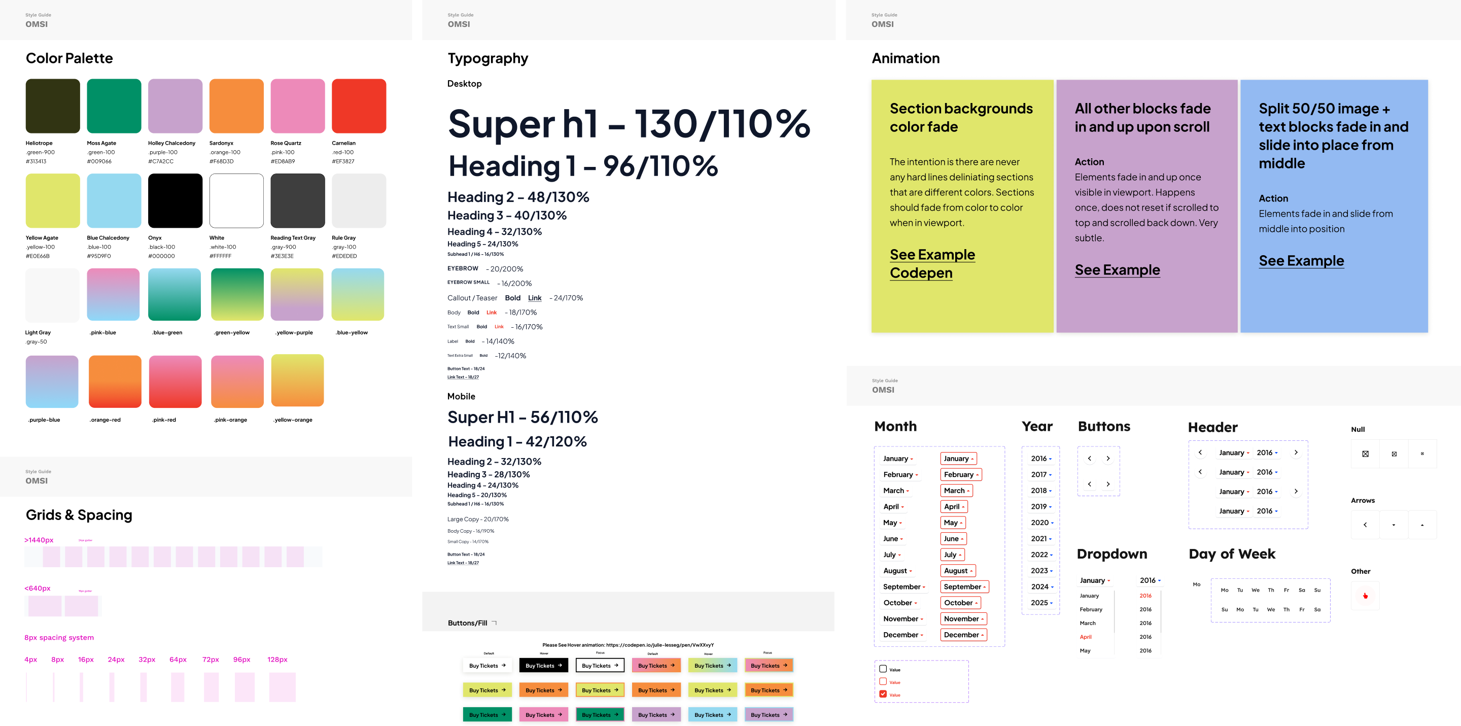
- Visual Design and UI
Engineering
- Technical Planning
- Digital Ecosystem Mapping
- Accessibility Optimization
- Custom WordPress Development
- Ticketure Integration
Explore More
