Feeding America
A gradual redesign for the largest hunger-relief organization in the nation.
Where we started: website optimization.
We’ve partnered with Feeding America since 2018, focusing first on two simple goals: drive donations and make website performance fast and stable.
We tackled this by migrating them off Luminate CMS onto Drupal 8, hosted on Pantheon, and layered in ongoing support for bug fixes, releases, performance optimizations, and forms migration. From this work, we saw great improvements:
- +84% increase in pageviews
- -16% decrease in bounce rate
- +19% increase in pages per session
- 28% increase in donations YOY on Giving Tuesday
Building out a design system.
When the initial work of site optimization was done, we shifted our focus to long-term website strategy. The first problem to tackle was a legacy of design debt; we needed a cohesive, reusable design system so we could approach future work more efficiently.
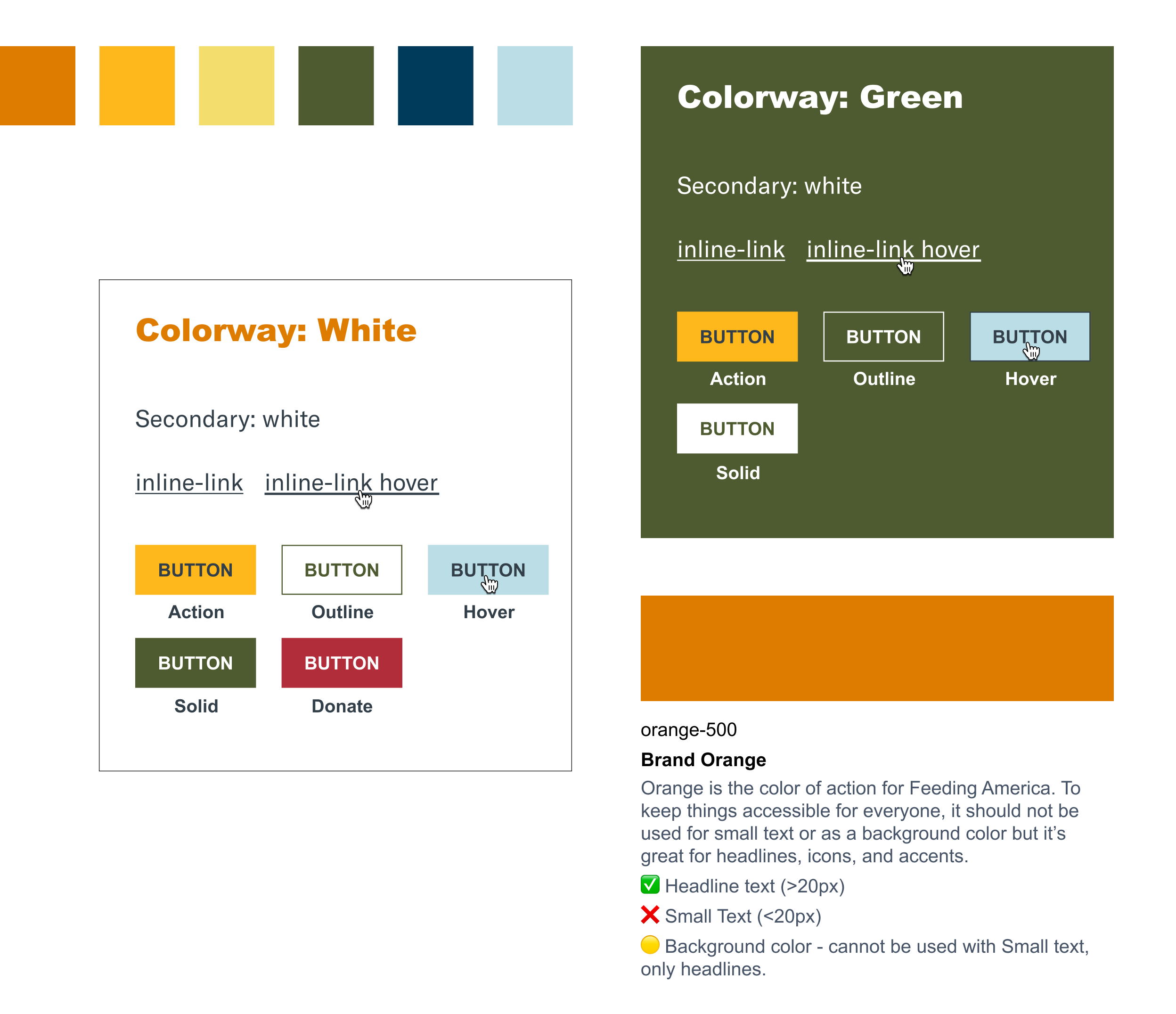
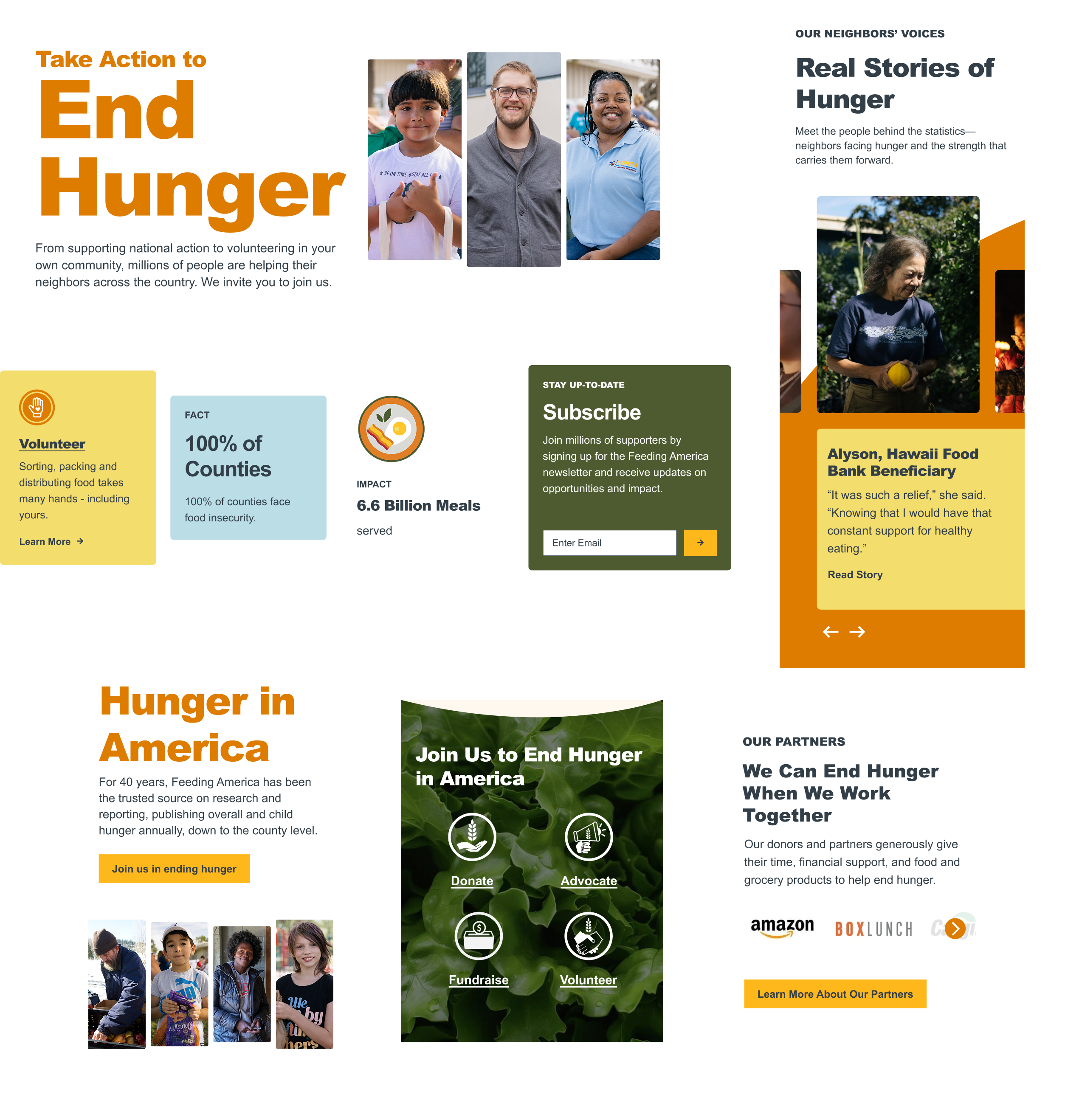
We audited the website, pulling everything “out of the garage” to see what block patterns emerged, then repackaged what already existed into a tighter, replicable system. In conjunction with Feeding America’s brand team, we built out a digital style guide to house an expanded typographic and color system. This new system allowed for us to play with the look and feel of design elements without losing the essence of their highly recognizable brand.
From transactional to transformational: a gradual redesign in action.
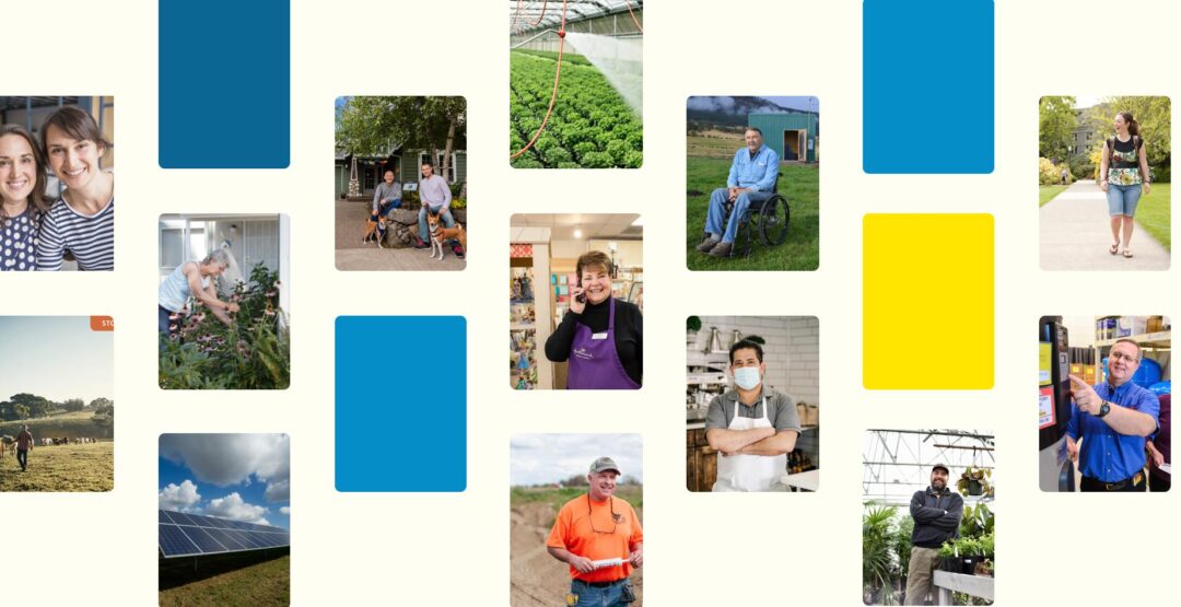
Beginning in 2020, Feeding America’s content strategy began to mature and evolve away from a primarily donor-centric website, and toward a movement-building transformational website. The website’s top pages needed to reorient around their multiple audiences — helping those facing food insecurity find food and resources easily, giving supporters clear paths to get involved, and keeping donors guided toward meaningful action.
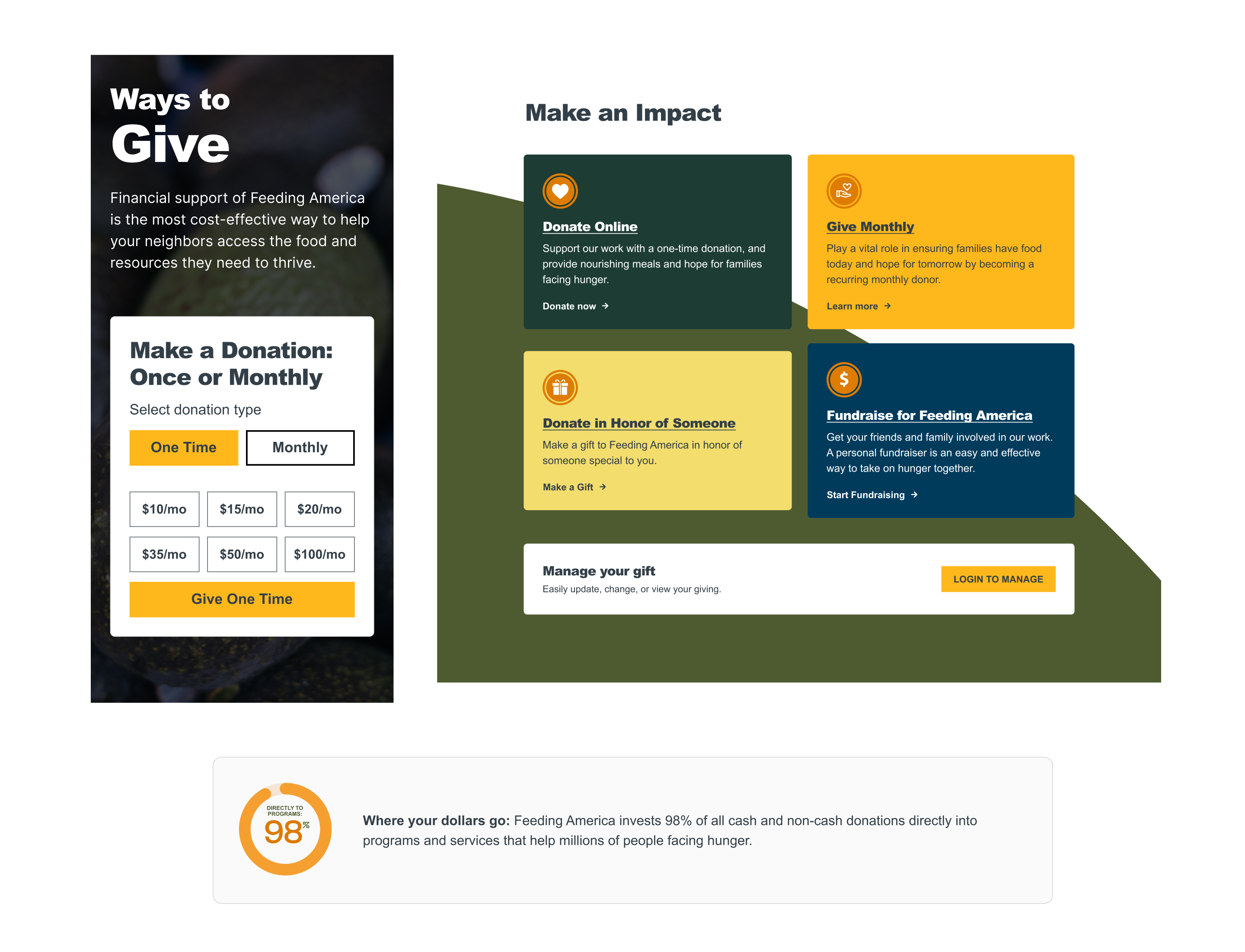
The pages redesigned so far include the Homepage, Hunger in America, Who Faces Hunger, the Hunger Blog, Ways to Give, and Take Action. Each page features a strong visual hierarchy that optimizes for wayfinding and human-centered storytelling, with data woven in to reinforce that while hunger is large in scale, it’s still solvable when everyone works together.
Ultimately, the entire site will reflect this new audience-driven design, and we’re partnering with Feeding America every step of the way.
Explore More