Bringing a dated Drupal website up to speed.
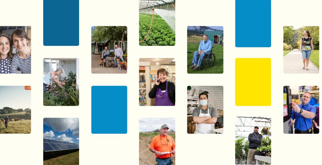
StopWaste is a public agency working to advance environmental sustainability and prevent food waste in Alameda County, partnering with nonprofits, businesses, schools, and local governments. When they came to us, their website was showing its age; the information architecture was disorganized, the brand felt dated, and their Drupal install was due for an upgrade.
We redesigned the site from the ground up, updating to the latest version of Drupal, migrating to a new content model, and applying a cleaner visual language that better reflects their mission and surfaces clear calls-to-action throughout.
Untangling the information architecture.
The biggest challenge and opportunity on this project was reorganizing the site’s information architecture.
Originally, content was organized around audience type and featured a main navigation bucketing users into “At Home, At Work, At School”. But StopWaste’s programs serve overlapping audiences — a business owner might share certain needs as a homeowner, for example — and we needed the new IA to address that.
So, we reorganized the top-level nav to be program-centric, with detail pages doing the work of narrowing down user type. This shift helps give users a clear picture of the breadth and depth of the programs StopWaste offers right away, making it easier to find the resources most relevant to them.
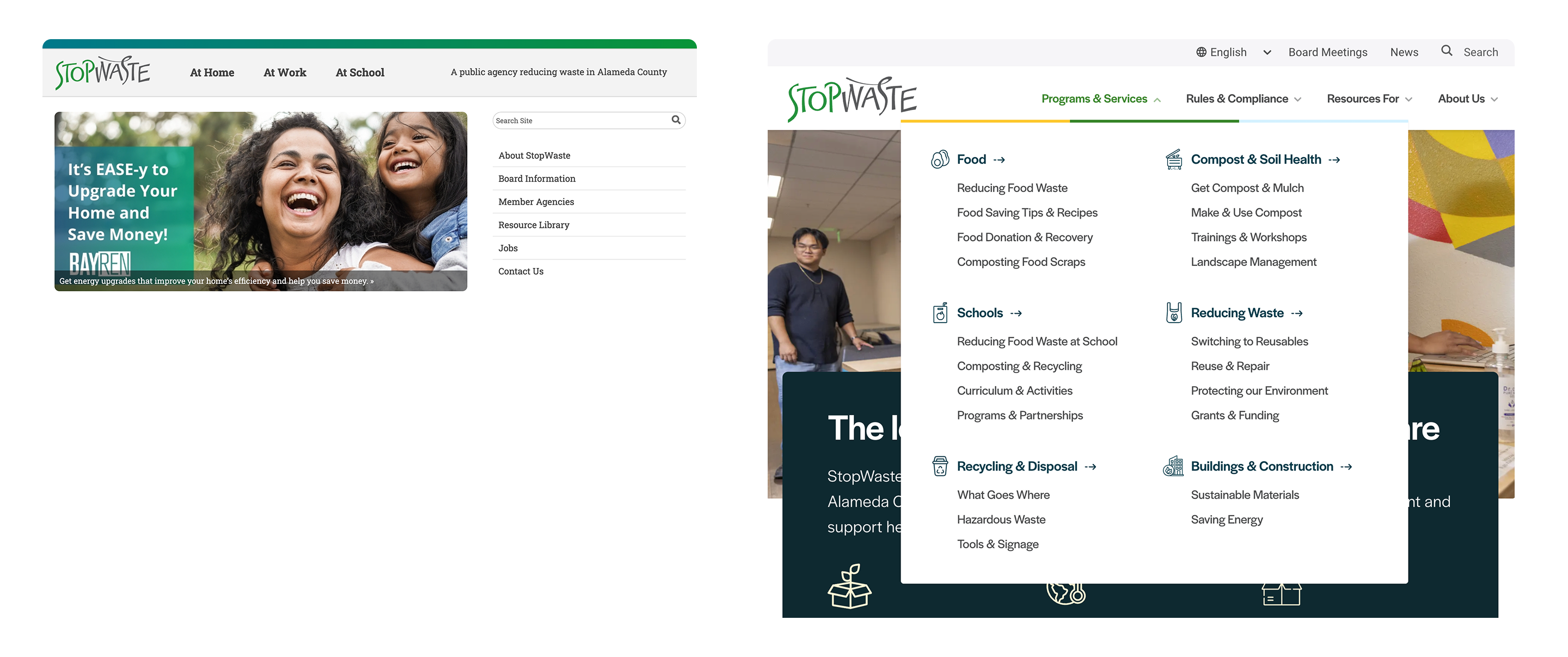
Right: Screenshot of the redesigned StopWaste homepage and navigation.
Serving a government agency’s unique needs.
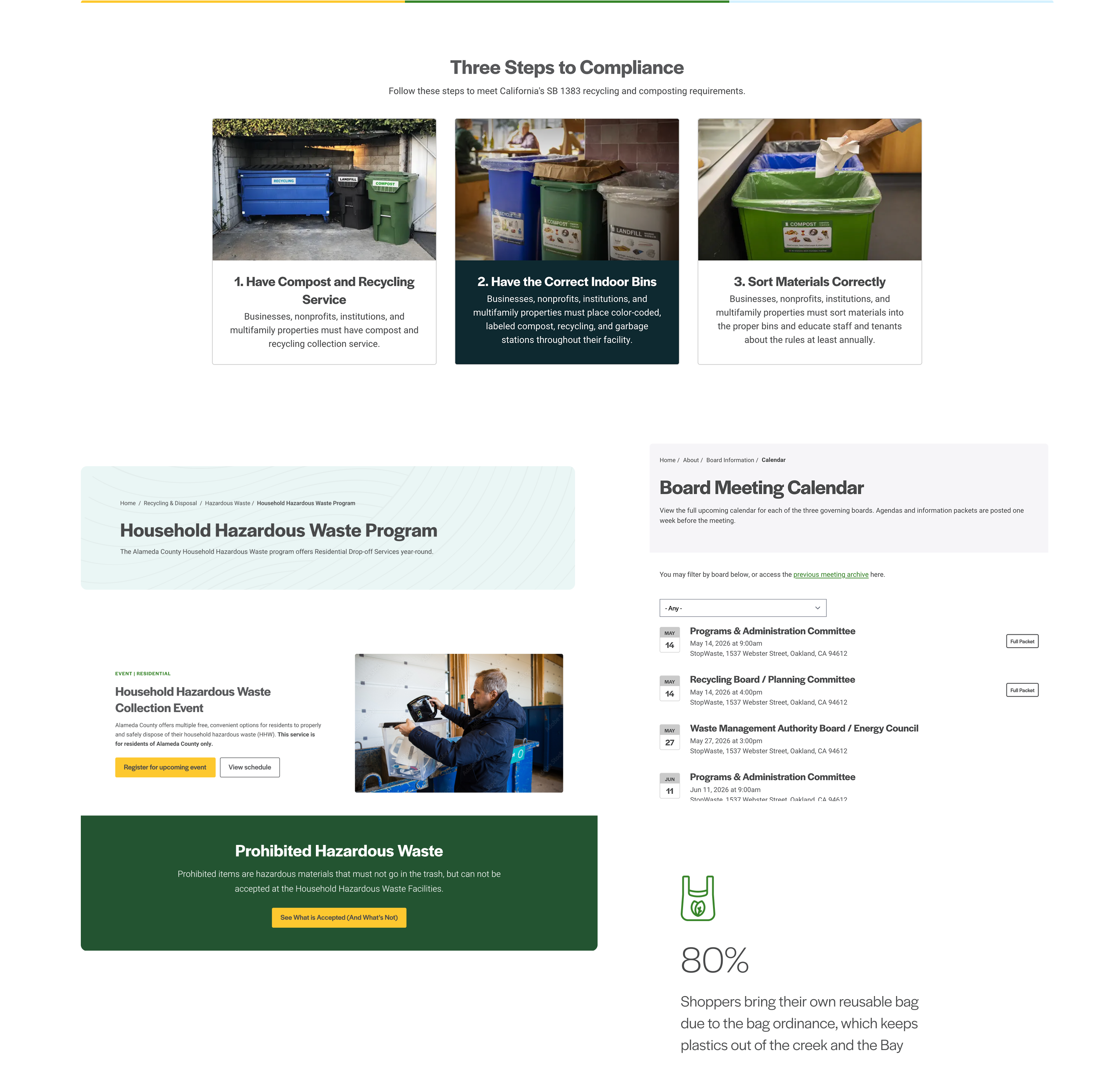
Because StopWaste is a government agency, in addition to connecting audiences with resources, the website also needed to communicate rules and compliance requirements that certain audiences are legally obligated to follow.
To address these requirements, we brought government and state policy legislation and compliance information to the forefront of the main navigation. This gives visitors a straightforward place to understand obligations and next steps if they’ve received a citation.
We also made sure board and staff resources were easy to find; board meeting events (that link to agendas and meeting minutes) are surfaced in the utility nav so board members can get to what they need no matter where they land on-site.
Results
The redesigned website gives StopWaste’s audiences a clearer path to relevant programs and resources; 3 months post launch, metrics showed:
- + 10.4% average engagement time
- + 17.8% engaged sessions per user up
- + 5.2% active users
Explore More