World Resources Institute
A dynamic Drupal distribution that puts environmental research, data, and analyses at the fingertips of global policy makers.
A Simplified, Content-focused Experience
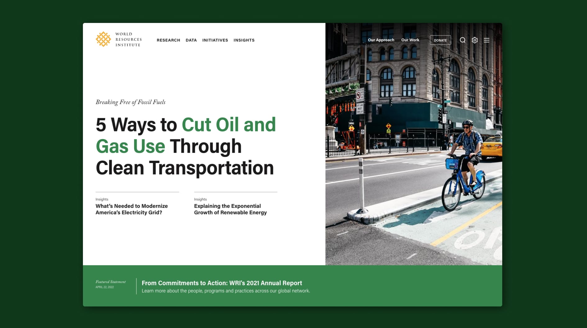
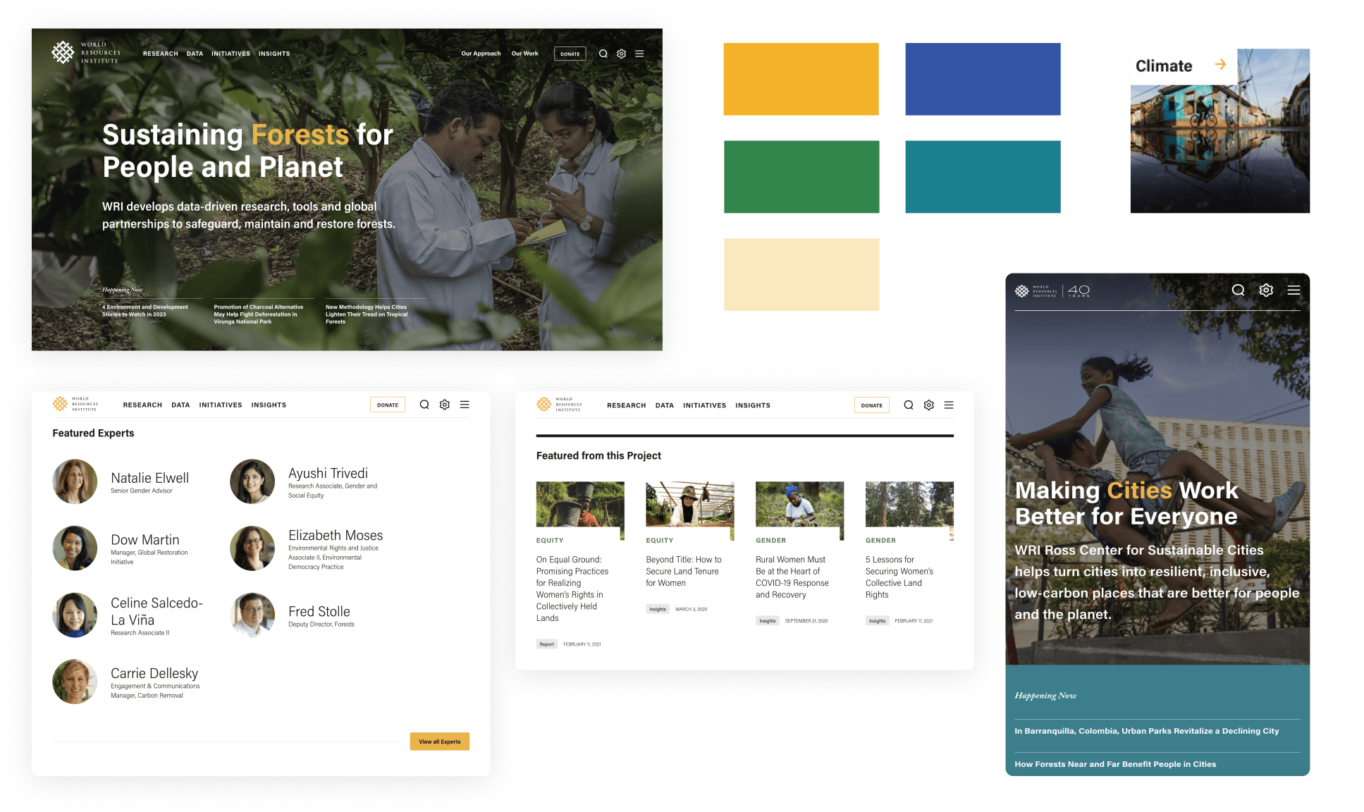
The World Resources Institute [WRI] has thousands of pieces of content, 12 international offices, and over 1,400 staff working in over 50 countries. We needed to redesign wri.org in a way that balanced simplicity with bold editorialism–restructuring their content to give users a taste of what is important in the moment, with open access to dive deep.
We archived thousands of pages of old content, simplified the sitemap, and renamed internal-facing naming systems to be clearer to users—all while maintaining search dominance. Pages were built so that their underlying structure stays the same as content or work changes. This system works to both (1) elevate high priority content and (2) push users to WRI’s robust resource library through a narrative taxonomy system, CTAs, and trending tags.
Opportunities for Expansion
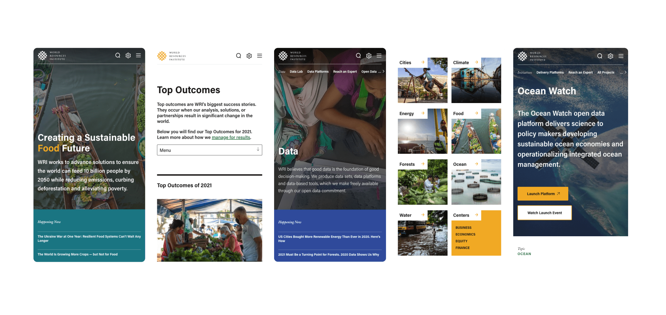
The new wri.org acts as a distribution–or, in other words, a framework that you can build new, individual sites from. In order to bring the distribution to life in Drupal, our engineers leveraged single file components [SFCs] in the build approach. Using SFCs creates blocks of functionality for the platform that can be extracted or not used at all when new sites are spun up. Think: lego-style building system that offers control and flexibility for new platforms, and minimum risk when conducting maintenance or updates. The WRI team, with support from ThinkShout, launched WRI China on the platform.
Feature Highlight:
Filterable Navigation
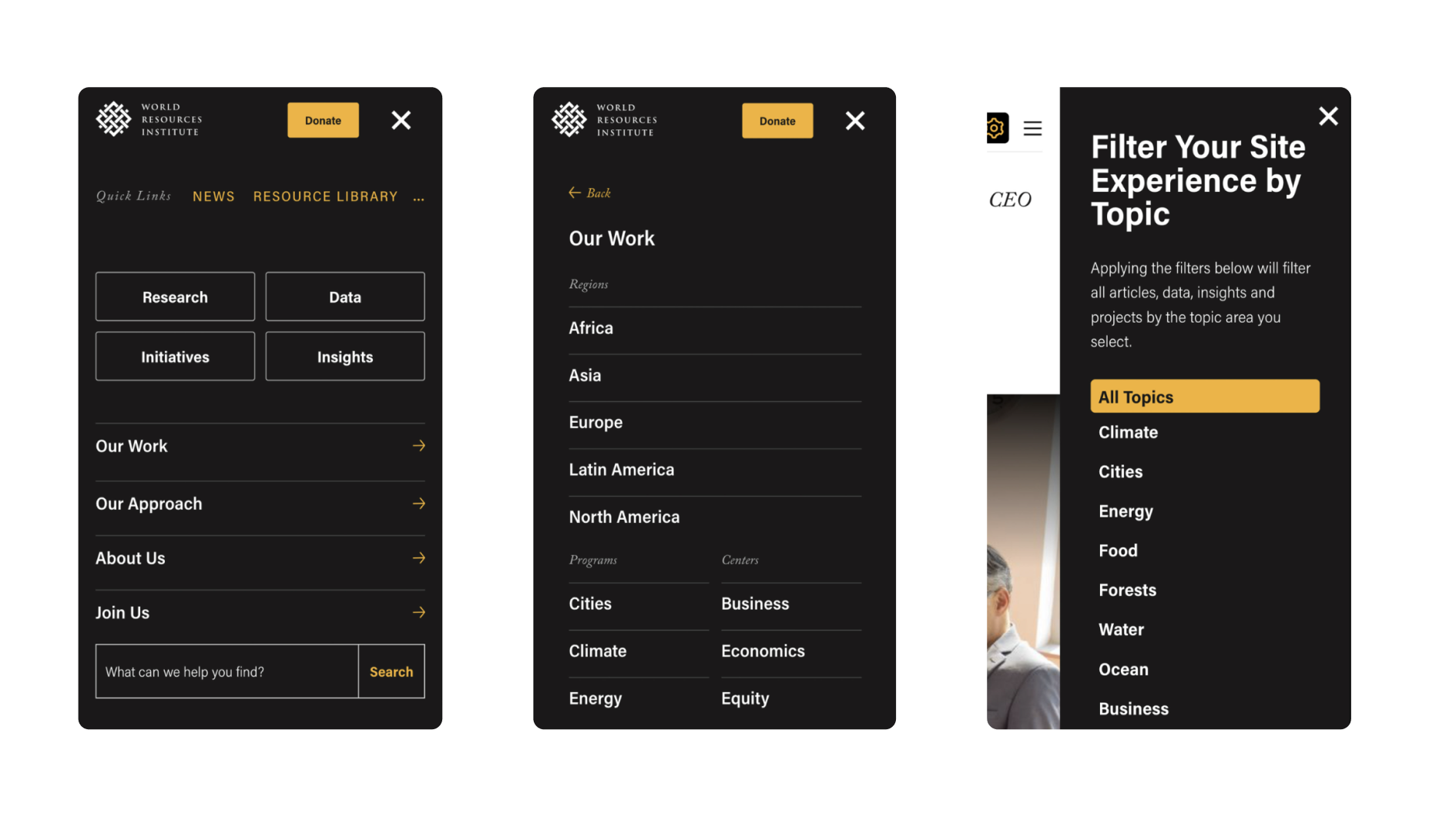
Simplifying the experience for users looking for content from specific focus areas was essential in connecting them with the content they are seeking. A slide-in menu with the ability to filter the entire site by individual topic areas resulted in a completely personalized, and fully accessible, experience. For example, a user can choose to filter the entire site by the program area ‘Ocean’; from there, pages subtly shift to display articles, data, insights and projects specific to the ‘Ocean’ topic area.
What’s more, this sitewide filter doesn’t sacrifice load time. Instead of requiring the javascript library to load automated content—which can be detrimental to accessibility needs and site speed—we set cookies for users, have views interpret those cookies, and then allow users to share those personalized pages with others.
Results and Early Wins
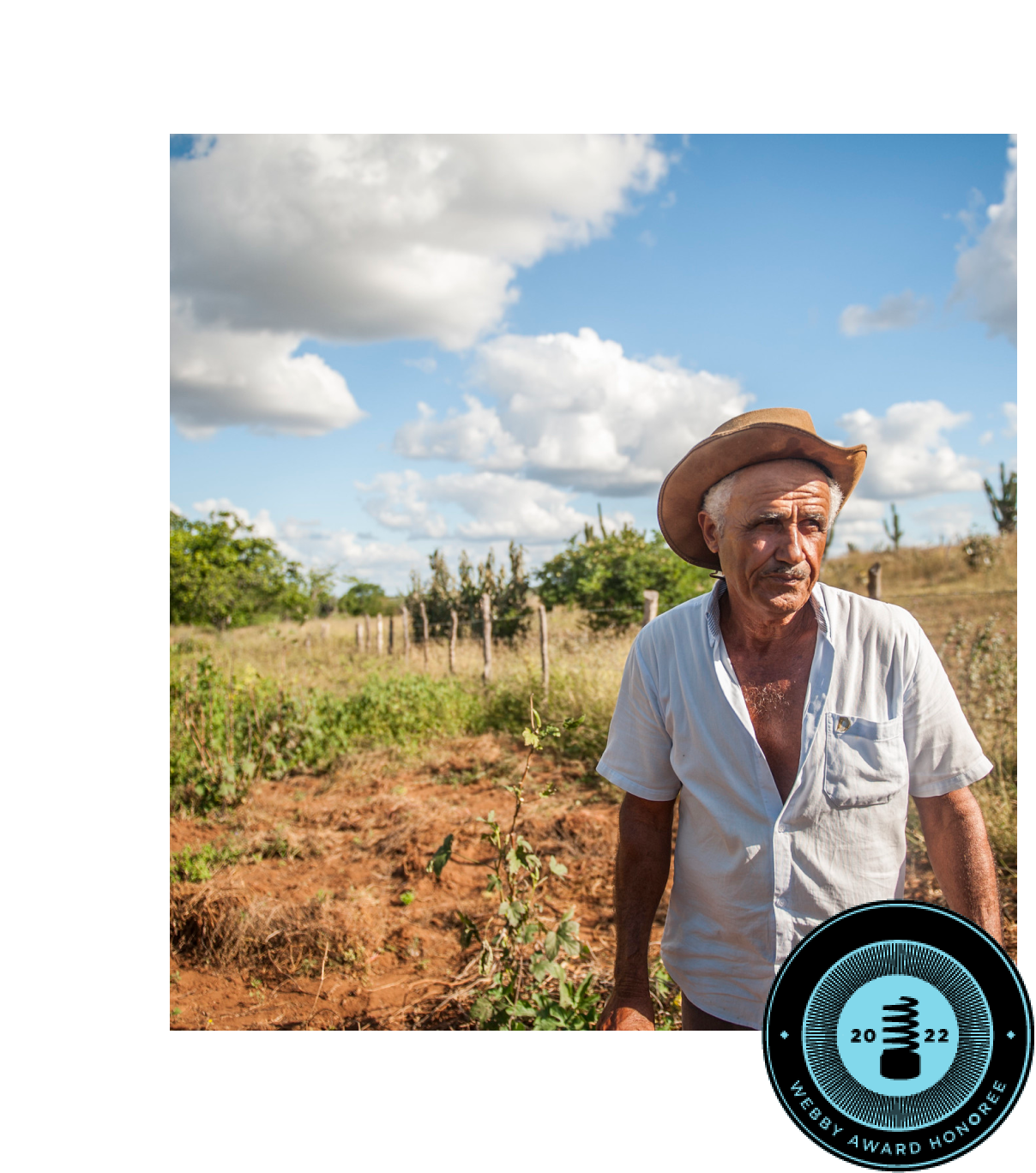
WRI’s digital platform showcases a user-centered content strategy, a refreshed design system, complex stakeholder engagement, and maybe most exciting of all, a turn-key solution for a distribution that hosts both WRI.org as well as international office sites. It was also recognized as a bronze medal winner in the 2022 Anthem Awards.
To date, this site has seen:
- A 16% increase in search traffic
- A 24% increase in new users
- A 19% increase in email list conversions
- A 22% increase in research downloaded
What We Did
Strategy
- Discovery Workshop
- Stakeholder Interviews
- Personas and User Journeys
- Engagement Strategy
- Personalization Strategy
- Measurement Planning
- SEO
- Information Architecture
Design
- Wireframes
- Creative Direction
- Visual Design and UI
- User Testing
Engineering
- Digital Ecosystem Mapping
- Migration Strategy
- Sitewide Filter
- Accessibility Optimization
- Custom Drupal Development
- Ongoing Support and Feature Planning

Explore More
